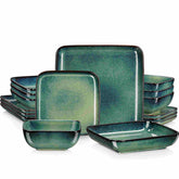
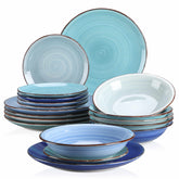
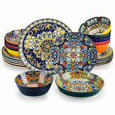
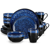
Runway to Table: How Fashion Color Palettes Are Transforming Ceramic Tableware
Listen to the audio version
Translate runway fashion trends into ceramic tableware. We discuss applying seasonal color palettes—from "quiet luxury" to "dopamine decor"—to create stylish, memorable dining experiences.
When you watch a runway show, you are not just seeing clothes walk; you are watching color strategy in motion. Those palettes that make the crowd lean forward in their seats are the same palettes that, a season or two later, make guests lean closer to your table. Working with ceramic tableware designers and stylists, I have seen over and over how the smartest “fashion colors” jump from gowns to glazes, from backstage mood boards to breakfast bowls.
This guide is your creative playbook for translating runway color stories into ceramic tableware that feels both of-the-moment and made-to-last. We will anchor everything in what design and hospitality brands are already doing, and pair it with practical advice you can use in the studio, at the kiln, or on your next styled tablescape.
Why Runway Color Belongs on the Table
Modern fashion is not just about what you wear; it is about the lifestyle you broadcast. That is why major fashion houses now treat the dining table as an extension of the runway. Brands like Dior, Versace, Gucci, Off-White, and Marni have all moved into homeware, creating plates, cups, and serving pieces that mirror their catwalk identities. A Dior place setting feels like a Dior dress. A Versace plate carries the same baroque drama as their prints. An Off-White collaboration with Ginori 1735 overlays street-style motifs onto traditional porcelain silhouettes.
Color is the backbone of this translation. According to brands like Coton Colors, the palette you choose for a tablescape sets the tone, defines the style, and creates a sense of unity that guests feel before they take a single bite. Color psychology backs this up: whites feel clean and fresh, blues calm and trustworthy, greens grounding and natural, yellows cheerful and energizing, oranges sociable, reds passionate and stimulating, pinks playful or romantic, purples luxurious and artistic, browns comforting, blacks sophisticated and dramatic, and metallics celebratory and glamorous.
Hospitality studies highlighted by tabletop companies show that plate color strongly shapes how food is perceived. One training experiment with food professionals found they instinctively preferred desserts on harmonizing plates and even moved dishes onto more appealing dinnerware. Designers and interior experts also note that food and tableware color can influence cravings and appetite, a link reinforced by a 2025 study cited by DecorMatters.
In other words, runway color is not just pretty. It is a strategic tool that affects mood, appetite, and memory in the dining experience.

Decoding the Runway: Color Stories Traveling to Ceramic
Fashion reports and design trend guides give tableware designers a treasure map of color directions. Several consistent themes appear across recent research.
Seasonal Color Stories and Dopamine Decor
Haute couture works in seasons, and so does tableware. Color-of-the-year declarations from color authorities like Pantone ripple through clothing, interiors, and eventually dishes. The Catalonia Plates team notes how Spring runway greens and soft pinks quickly echo on salad plates and stemware, while dopamine décor trends push joyful, saturated hues into dinner sets.
Brands like Vancasso have codified these shifts into clear palette shortlists. For 2025 they highlight Earthy Terracotta, Deep Green, Warm Butter Yellow, Classic Blue, Soft Beige, Cool Gray, Natural Brown, Matte Black, Blush Pink, and Bold Red. The idea is to treat tableware color as a fashion statement and mood-setter rather than a neutral background.
VistaPrint’s color trend report for 2026 tells a similar story in branding language. Palettes carry names like Mermaidcore, Banana Yellow, Tangerine Disco, Sunwashed Soft, Clubroom Contrast, Neon Shock, and Walnut Retro. These describe not only colors but attitudes: dreamy, nostalgic, theatrical, sun-faded, luxurious, electrified, and grounded.
Ceramic designers can read these reports the same way fashion designers do and then ask a simple question: how would this palette feel as a glaze on clay?
The Foodification of Color
Interior and color experts at DecorMatters describe the “foodification” of color: naming and using hues after foods to tap into sensory memories. Butter yellow, mocha mousse, martini olive, tomato red, blueberry milk—each instantly evokes taste, warmth, or nostalgia.
House Beautiful highlights a related trend in paint and décor, backed by a study from The Paint Shed that found more than 500,000 people in the UK searching for food-themed paint colors, with triple-digit growth in searches for butter yellow, espresso, and candy apple red. A psychotherapist quoted in that study connects this to comfort foods and emotional wellbeing, rooted in childhood and cultural memories.
For tableware designers, this is a gift. When you choose “tomato red” instead of generic red, or “martini olive” instead of generic green, you are sneaking flavor into color. You are using language and palette to make a plate feel cozy before it even hits the table.
Quiet Luxury and Earth-Reimagined Neutrals
Not every table wants to shout. Trend intelligence from suppliers like Raylon and luxury-focused brands notes a powerful “quiet luxury” movement in tableware: refined simplicity, textured neutrals, and honest surfaces that feel elevated without being flashy.
Raylon’s 2025 color story “Earth Reimagined” revolves around grounded tones like Pantone’s Mocha Mousse, a warm cocoa brown, alongside orange, lime, nautical blue, crocus, and bran-inspired shades. Royalware and similar luxury producers emphasize ivory, cream, soft grays, and natural browns as enduring, versatile bases that let food be the star.
Market data in Raylon’s research suggests growing demand for matte and satin finishes, with a 2024 industry report showing double-digit growth for these tactile, non-gloss surfaces. Combined with neutral, earth-based palettes, this creates tableware that feels both sustainable and sophisticated.

Palette Architecture: Building Runway-Inspired Color Systems
Runway presentations are rarely about a single color. They orchestrate base tones, accents, and metallics. Ceramic tableware can do the same.
Capsule Neutrals as the Foundation
Designers and hosts alike tend to build from a neutral base. Coton Colors recommends crisp white plates as flexible foundations. Vancasso’s guides emphasize soft beige, cool gray, and natural brown stoneware as warm, grounded anchors that work in rustic, minimalist, or Japandi-inspired interiors. Luxury brands frame ivory and subtle gray porcelain as the quiet backbone of high-end dining.
These neutrals have clear pros. They photograph beautifully, outlast trends, and pair with almost any accent shade. They also play nicely with pattern: you can layer florals, stripes, or heritage motifs on top without overwhelming the eye. Modern dinnerware experts note that white and neutral porcelain remains a favorite because it enhances food colors and suits both everyday and formal occasions.
The main con is that pure neutrals by themselves can slide into visual boredom, especially on social media or in retail displays. That is where runway-style accents come in.
Statement Shades: Butter, Tomato, and Disco Citrus
Color trend writers describe a shift away from anonymous beige toward emotionally expressive hues. Warm Butter Yellow shows up across multiple sources: as a fashion color of the year, a rising paint search term, and a recommended tableware tone for spring and outdoor gatherings. It is brighter than cream yet softer than neon, associated with comfort food and morning light.
Tomato red, popularized by “tomato girl summer” aesthetics in fashion, appears in DecorMatters’ list as an energetic, carefree shade best used as an accent or focal point. Designers suggest it for bold pops against neutrals.
VistaPrint’s Tangerine Disco sits between cinnamon and bright orange and is linked to retro nightlife and current pop culture. It is perfect where you want your table to feel like a party, not a board meeting. Neon Shock palettes use intense greens, yellows, pinks, and oranges sparsely, as exclamation marks on key elements.
These high-energy shades bring dopamine décor to the table. The upside is immediate mood-lift and highly shareable visuals. The downside is that these colors can date quickly if overused, and they may fight with delicate food presentations. Smart designers treat them like runway accessories: powerful, but best in measured doses.
Nature-Driven Blues and Greens
If you scroll through modern dinnerware collections, you notice how many rely on blues and greens. Coton Colors and Vancasso both highlight blue and green as key directions. Blue is framed as calm and trustworthy, ideal for serene brunches, coastal themes, and spring events. Deep or classic blue, paired with white, evokes clean, seaside-inspired tables. Lighter “blueberry milk” or periwinkle tones, cited in foodified color discussions, bring a whimsical, airy look.
Greens stretch from mint and sage to forest and olive. Vancasso notes that mint and apple green feel fresh and modern, while forest and olive create a cozy, earthy atmosphere. Interior and sourcing experts point out martini olive as a color that feels both sophisticated and fun, especially with wood and neutral companions.
From a food perception standpoint, greens and blues need handling with care. Research summarized by GetServeware suggests that green plates signal freshness and vitality, while blue can be calming but may dull appetite if used too heavily with certain foods. The practical takeaway is to pair green and blue ceramics with menus that support their message: greens with salads and herb-forward dishes, blues with seafood, citrus, and lighter meals.
Soft Pastels and Romantic Blushes
Romantic and ethereal aesthetics drawn from fashion houses like Dior and Valentino translate to soft pastel palettes and delicate florals on plates. Vancasso’s peach and blush pink dinnerware is recommended for tea parties, outdoor summer gatherings, and romantic dinners, especially when paired with warm-toned foods like roasted carrots, butternut squash soup, salmon, and vanilla desserts.
VistaPrint’s Sunwashed Soft palette adds another layer: dusted pinks, chalky blues, pale terracottas, and muted olives that look naturally faded by the sun. Brands are using these “lived-in” tones to signal authenticity and comfort.
The advantage of these palettes is emotional subtlety. They are gentle, flattering to skin tones around the table, and forgiving with a wide range of menus. The challenge is avoiding saccharine or washed-out effects. Good ceramic design here leans on texture, hand-painted details, or contrast with darker linens and flatware.

From Mood Board to Mug: Translating Fashion Palettes into Ceramic Decisions
Knowing that Mermaidcore or Walnut Retro is trending is one thing. Turning that into a sellable, usable ceramic line is another. Designers who succeed treat runway palettes as starting points, then adapt them through three concrete decisions: base neutrals, accents, and metallic or surface effects.
Here is one way to frame it in practice:
Palette Name |
Base Glaze Tone |
Accent Glaze or Detail |
Metallic / Finish Accent |
Best For |
Butter Brunch |
Warm butter yellow |
Soft white or cream edging |
Brushed gold rim or handle |
Spring brunch sets, outdoor garden parties |
Mermaid Shore |
Soft aqua or teal |
Pearlescent purple pooling in wells |
Iridescent or satin finish |
Coastal and Mermaidcore-inspired dinnerware |
Quiet Cocoa |
Mocha mousse brown |
Lighter beige speckling |
Minimal platinum or no metallic |
Everyday “quiet luxury” plates and bowls |
Tomato Disco |
Tomato red coupe plate |
Tangerine orange inner band |
High-gloss glaze for light reflection |
Festive dinner plates, tapas, or statement chargers |
Notice how each system builds from a base that can work across seasons, then injects runway-inspired accent hues and finish choices.
Surface Finishes as Fabric Analogues
The Catalonia Plates team draws a compelling parallel between fashion fabrics and tableware finishes. A high-gloss glaze reflects light the way satin eveningwear does, creating a glamorous sheen under candles or spotlights. Matte porcelain evokes the quiet richness of cashmere. Metallic flecked glazes stand in for sequins, catching the eye as guests pass dishes around.
Raylon’s research notes significant growth in demand for matte and satin surfaces, along with crystalline glazes that embrace controlled imperfections. These “honest surfaces” feel artisanal and tactile, aligning with global preferences for handcrafted narratives in objects.
When you choose a finish for a runway-inspired palette, think like a fabric buyer. A Neon Shock accent might work best in a smooth, glassy pool for maximum impact. A Sunwashed Soft palette might lean into matte, powdery textures. A Clubroom Contrast scheme based on deep black and metallic gold benefits from glossy black and either brushed or mirrored metallic trims to underline luxury.
Shape and Color in the Same Story
Runway looks are never just about color; they are about silhouette. Tableware follows the same logic. Catalonia Plates likens wide, flat coupe plates to minimalist slip dresses and angular or asymmetrical dishes to avant-garde statement garments.
Dinnerware trend reports from Kim Seybert and others observe a rise in dynamic shapes: geometric, organic freeform, wavy edges, sculpted rims, and cut-outs. When you pair these forms with particular palettes, you tell a clearer story. Matte black on sharply angled chargers screams edgy modern, echoing fashion houses like Balmain or Alexander McQueen. Pastel glazes on softly scalloped rims whisper romantic, aligning with Dior-like tables.
The key is coherence. If your color palette signals “quiet luxury,” consider restrained shapes with subtle details. If your palette is Neon Shock or Tangerine Disco, you have permission to go irregular and playful.

A Practical Runway-to-Table Workflow
Creative color work is fun; production is where things get real. Several sources offer concrete practices that ceramic designers and brands can apply.
Start by defining the mood and event types you are designing for. Coton Colors suggests beginning any palette by naming the emotional tone: relaxed and cozy, bright and celebratory, or refined and formal. Vancasso’s color guide adds another lens, distinguishing warm-toned tablescapes for energetic, casual gatherings from cool-toned sets for sophisticated, high-end events. The same principle applies when you design a ceramic line: decide whether it is built for family brunches, corporate dining rooms, coastal rentals, or urban wine bars.
Next, build a visual mood board. Coton Colors recommends collecting images, textures, and elements to clarify your palette, while DecorMatters encourages testing foodified colors digitally using tools that let you preview hues in context before you commit to paint or production. For ceramics, this can include pairing glaze samples with photos of actual dishes and table linens to see how they interact.
Then, test your palette with food. Research summarized by GetServeware shows that beige foods like potatoes or cream sauces look bland on similar-colored plates, but pop against darker warm plates like black or brown. White plates flatter almost all food colors yet can feel generic without variation in shape or texture. Red dishes shine against white or green backdrops. Yellow and orange foods gain drama on contrasting blues, while green foods stay fresh-looking with yellow and other warm accents. In my own styling work, I like to photograph the same dish on at least three different glazes and evaluate which image feels most appetizing and aligned with the brand mood.
Lighting needs attention too. Tableware experts point out that natural light makes colors appear brighter and cooler, ideal for daytime events, while candlelight and dimmed evening lighting warm tones and deepen colors. Raylon advises buyers to request glaze samples under different lighting to ensure color consistency and avoid unpleasant surprises once plates are installed in real spaces.
Durability and safety cannot be an afterthought. Sourcing guides recommend validating that pieces meet food-contact standards and pass leach testing for metals like lead and cadmium, especially for textured or heavily decorated surfaces. They also suggest running multiple dishwasher cycles and testing chip resistance to avoid negative customer experiences with fragile edge styles. When you push into high-fashion shapes or raw clay finishes, you still need the underlying engineering to support daily use.
Finally, consider sustainability and story. A McKinsey report cited in Raylon’s research notes that a large majority of global consumers prioritize sustainability, pushing demand for recycled materials, bio-based glazes, and honest claims about recycled content. Malacasa and others highlight growing use of recycled, vegan, and non-toxic materials in modern dinnerware. Ceramics that last longer and resist chipping are framed as eco-friendly choices in their own right. When you talk about your runway-inspired collection, being able to say that the mocha brown glaze uses a high percentage of recycled content or that the matte white base is designed for longevity turns a color trend into a values statement.

Pros and Cons of Chasing Runway Color in Ceramics
If you work in color long enough, you learn that trends are both opportunity and trap.
On the plus side, runway-driven palettes give you a head start on what shoppers and hospitality clients already want. They help your catalog feel current and make your pieces more photogenic in an era where social media visibility matters. Food52’s buyers and interior stylists interviewed in magazines describe how a few colorful statement pieces can refresh entire tablescapes without replacing everything, which is exactly the role runway colors can play in your assortment.
Runway inspiration also pushes creativity. It nudges ceramic designers to explore deeper reds, softer browns, or unusual greens they might not have considered. Trends like Mermaidcore encourage experimentation with iridescent glazes and layered visuals that evoke water and light, while Walnut Retro frames brown not as dull but as rich and comforting.
The downside is trend fatigue. Neon accents and tomato reds that feel fresh this year can feel overexposed the next. Production realities amplify this risk; ceramic runs take time to design, test, and manufacture. That is why many successful brands build around timeless neutrals and use fashion colors for mix-and-match pieces, seasonal collections, or accent items like dessert plates and mugs.
Quality control is another challenge. Raylon notes that glaze batch variation can erode trust if colors shift noticeably between orders. The more complex and saturated the palette, the more important it is to lock down consistent recipes and verify color stability in firing and everyday use.
In practice, the most resilient strategies treat runway color as a layer, not the foundation. Anchor your line in whites, beiges, grays, and natural browns. Then ride the waves of butter yellow, tomato red, disco orange, and mermaid periwinkle through accessories and limited-edition series that you can update as trends evolve.

Short FAQ: Designing Runway-Inspired Ceramic Palettes
How many fashion-forward colors should I include in one ceramic collection?
For most lines, it is safer to center on two to four core neutrals and one to three fashion-forward colors. Trend reports from tableware and branding sources encourage building small, coherent palettes rather than trying to cram in every hue. Think in terms of a capsule wardrobe: a strong base plus a few remarkable accents.
Should I build an entire dinnerware set around a single color of the year?
It can be tempting, but research on longevity and investment in high-end dinnerware suggests that neutral-based sets stay relevant longer. Use color-of-the-year shades like Warm Butter Yellow or a current Pantone direction as accent salad plates, bowls, or seasonal pieces that layer onto your main sets. That gives your customers freshness without forcing them into a palette they might outgrow.
Are food-named glazes just marketing, or do they really matter?
The naming is marketing, but it is grounded in psychology. Studies highlighted by The Paint Shed, DecorMatters, and House Beautiful show that food-evoking colors and names tap into comfort, nostalgia, and sensory memory. When you call a glaze “Mocha Mousse” instead of simply “Brown,” you help customers imagine how it will feel at breakfast or after dinner. That emotional shorthand is powerful for both retail shoppers and hospitality buyers.

A Joyful Closing from the Colorful Tabletop Curator
Runway color stories are not meant to stay on the catwalk. When you translate them into ceramic glazes, textures, and silhouettes, every plate becomes part of a bigger narrative about how we want to live, eat, and gather. Start with a grounded neutral base, borrow boldly from fashion’s favorite shades, respect what research says about how color shapes appetite and emotion, and keep your eyes on both beauty and durability. Do that, and your table stops being a flat surface and becomes a living, ever-evolving runway of daily joy.
References
- https://www.red-dot.org/magazine/tableware-design-to-suit-every-taste
- https://decormatters.com/blog/the-foodification-of-color-sweet-savory-and-tangy-shades-to-spice-up-interiors
- https://food52.com/pages/table-mix-and-match
- https://www.getserveware.com/how-using-color-dinnerware-affect-food-presentation/
- https://www.jampaper.com/tableware/by-color?srsltid=AfmBOormakCe6xDK8RKPhBrKJust0cTe5DZZVVenfF5X7d6vLKojKms4
- https://mdmaison.com/blog/modern-dinner-plates-the-best-contemporary-designs-for-the-best-dining-experience
- https://produkto.io/color-palettes/tableware
- https://www.royalwarechina.com/luxury-dinnerware-sets-tableware/
- https://thistlewoodfarms.com/how-to-mix-and-match-plates/
- https://www.vistaprint.com/hub/color-trends?srsltid=AfmBOoqFPo92HEuH6mL09WYxYNe3jYafptoHdDF5XKfltqTLgdwxHh0S


