

Yes, though the effects are smaller than they are often made out to be. Research in sensory psychology shows that plate color can influence how you perceive portion sizes and how appealing food looks. The effects are real and measurable in controlled settings, though they vary by individual, cultural background, and context.
How Vision Takes the Lead at the Table
Of all the senses involved in eating, vision tends to dominate first. Before flavor or aroma registers, your brain has already begun forming expectations based on what it sees.
The most reliably demonstrated visual effect in dinnerware research is the Delboeuf illusion, a well-established optical phenomenon with a direct consequence for how we eat. When the color of your food closely matches your plate, contrast is low and the portion appears smaller than it actually is. High contrast makes the same portion read as more substantial. A simple example: pasta on a white plate tends to look like a modest amount, while the same portion on a dark navy or deep teal plate reads as considerably more. The food has not changed. The perception has.
What Each Color Is (and Is Not) Known to Do
Plate color affects appetite differently depending on the shade, and the evidence behind each claim varies widely. The table below gives a useful starting point before the detail.
| Color | General tendency | Evidence strength |
|---|---|---|
| White / Cream / Beige | Neutral backdrop; low contrast with pale foods | Strong (Delboeuf effect) |
| Blue / Navy / Dark Blue | Possible mild appetite suppression | Weak to moderate |
| Teal / Turquoise | Calming; good contrast with warm-toned foods | Limited |
| Red / Rustic Red / Terracotta | Uncertain; may act as a mild stop signal | Weak, inconsistent |
| Green / Dark Green / Jade | Health associations; contrast benefit with pale foods | Moderate (cultural) |
| Yellow / Orange | Warm, inviting atmosphere | Weak, mood-adjacent |
| Black / Dark Grey | Strong visual contrast; no clear appetite effect | Moderate (perceptual) |
| Grey / Light Grey | Neutral; limited appetite effect | Limited |
| Multicolor / Bold patterns | May reduce portion clarity | Indirect |
White, Cream, and Beige
White and cream are the default for good reason. They provide a neutral, high-contrast backdrop that makes most foods look vibrant and well-presented. The tradeoff is low contrast with pale foods like pasta, rice, or cream-based sauces, which can lead to underestimating portion size. Beige and cream feel warmer and less clinical than pure white, making them well-suited to casual everyday settings.
Blue, Navy, and Dark Blue
Blue is often cited as a natural appetite suppressant. The logic has some basis: blue foods are rare in nature, and the brain may not associate this color strongly with eating. However, most supporting research examines room color and ambient lighting rather than the plate itself. What is more reliable is that dark blue shades create strong visual contrast with most warm-toned foods, which supports clearer portion awareness. Sea blue and water blue sit in a softer range and tend to feel calming rather than appetite-dampening.
Teal and Turquoise
Teal and turquoise sit between blue and green in both hue and psychological effect. They carry some of the cool quality of blue while feeling less stark, and they pair well with orange-toned foods such as salmon, roasted squash, and tomato-based dishes.
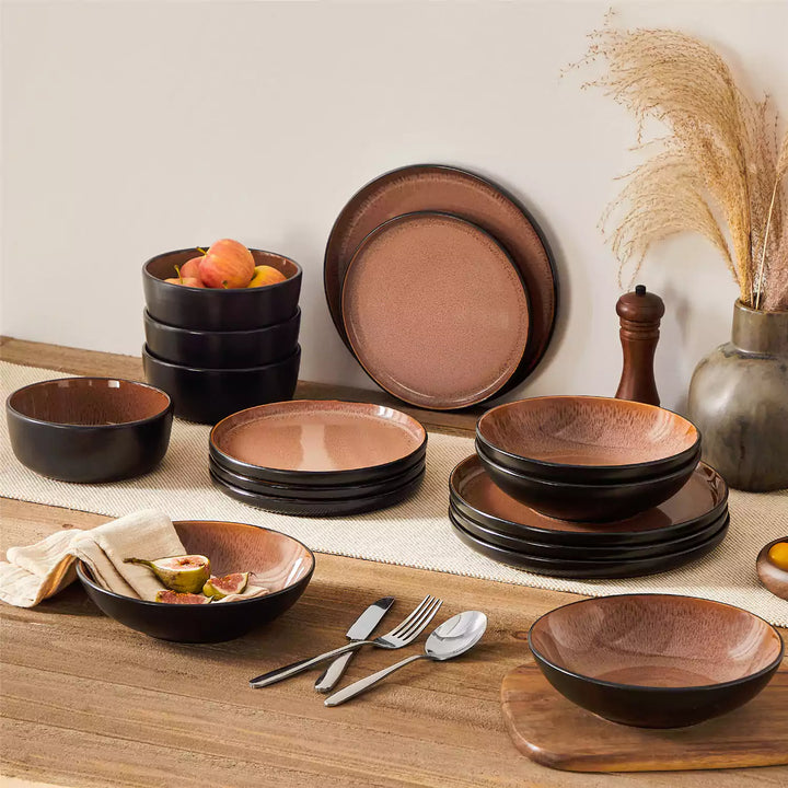
Red, Rustic Red, and Terracotta
Red is frequently described as appetite-stimulating due to associations with fast food branding. That is a cultural conditioning effect, not a property of the color itself. Separately, a study published in the journal Appetite found that participants consumed less from a red cup than a blue one, suggesting red may function as a mild stop signal. The sample was small and replication results have been inconsistent, so this finding should be treated with caution. Rustic red and terracotta carry a warmer, earthier quality that reads very differently from a saturated signal red.

Green, Dark Green, and Jade
Green carries strong cultural associations with health and freshness in most Western contexts. Serving vegetables, grains, and salads on green plates can make these foods feel more natural at home and visually appealing. This is a psychological effect rooted in cultural conditioning rather than physiology, and it does not hold universally across cultures. Dark green and jade also create high visual contrast with pale foods, adding a functional benefit on top of the aesthetic one.

Yellow and Orange
Yellow and orange are broadly associated with warmth, energy, and casual optimism. They tend to create an inviting atmosphere around a meal. The specific claim that yellow plates cause overeating is not well-supported by controlled research. Their influence is more accurately described as mood-adjacent: they can make eating feel more relaxed and enjoyable, particularly in social or informal settings.

Black and Dark Grey
Black and dark grey create the strongest visual contrast with most foods, making portions highly visible and presentation striking. No substantial research links either color to meaningful changes in appetite. Dark grey carries a slightly softer visual weight than black, making it more flexible across both casual and formal contexts.
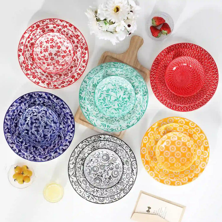
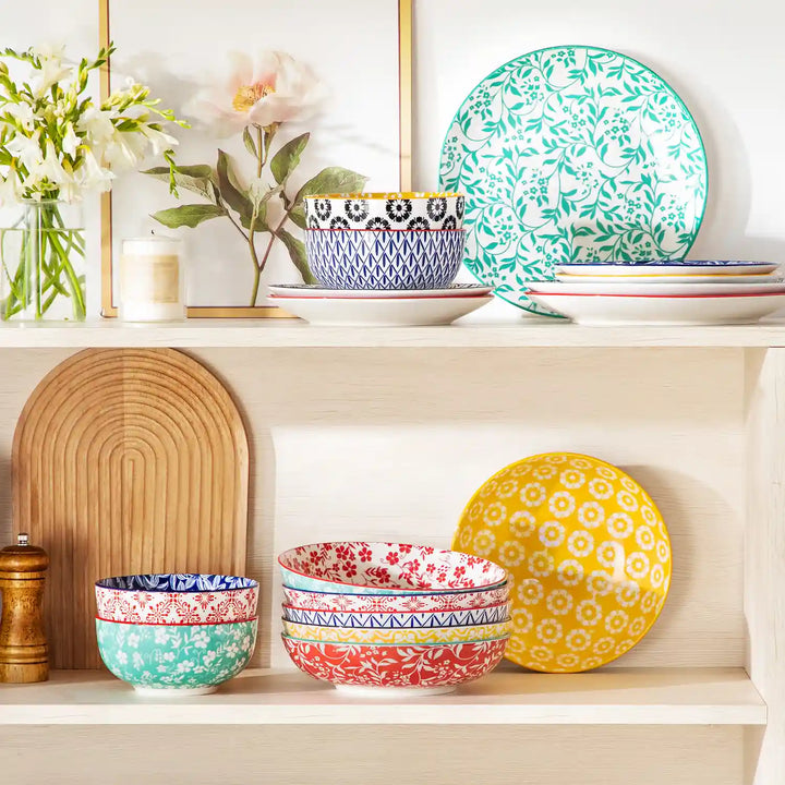
Multicolor, Bohemian, and Bold Patterned Plates
Heavy patterns can reduce the clarity of portion boundaries, making it harder to track how much is on the plate at a glance. For mindful everyday eating, simpler backdrops tend to be more practical. For celebratory or social meals, rich and vibrant combinations can make the table feel lively without any real behavioral downside.

Three Variables That Matter More Than Color
Plate size has the most robust evidence of any dinnerware variable. Larger plates consistently lead people to serve and eat more, independent of color or hunger level. If portion awareness is a genuine priority, plate size is the first variable worth reconsidering, well ahead of color.
Rim width affects how much of the plate center is visible. Wide decorative rims reduce the apparent serving area, making the same portion look larger by comparison. This is the same contrast-and-framing logic that underpins the Delboeuf illusion, applied to the plate's own geometry.
Bowl shape matters for foods like pasta, rice, and soup. Deep, narrow bowls lead to more accurate portion estimates than wide, shallow ones, because depth makes quantity more visually legible rather than spreading it thin across a large surface.
FAQs About Plate Color and Appetite
Q1: Does Plate Color Affect How Food Actually Tastes?
Yes, to a degree. Studies have shown that color can alter taste perception before a single bite is taken. Strawberry mousse served on a white plate is consistently rated sweeter than the same mousse on a black one. The brain draws on visual cues to anticipate flavor, and those expectations influence what you actually experience.
Q2: Does Plate Finish (Matte vs. Glossy) Affect the Dining Experience?
It can. Glossy surfaces tend to make colors appear more saturated and food look more vibrant, while matte finishes create a softer, more understated presentation. Research on finish is limited compared to color, but texture perception through touch has been shown to influence taste expectations, particularly for fine dining contexts.
Q3: Do Children Respond to Plate Color Differently Than Adults?
Yes. Children are generally more responsive to bright, high-contrast colors and show stronger behavioral reactions to visual food cues than adults. Serving vegetables on a plate with a color children associate positively can improve acceptance. The effect tends to diminish with age as eating habits become more habitual and less visually driven.
Q4: Does Dining Room Lighting Change How Plate Color Works?
Yes, significantly. Warm yellow lighting shifts how colors read, making cool-toned plates appear more neutral and muting the contrast effects discussed in this article. The psychological impact of any plate color is partly a product of the light it sits under, which is why restaurant lighting design is treated as seriously as tableware choice.
Q5: Do These Effects Apply to Bowls, Mugs, and Other Vessels?
Largely yes. The contrast and color association principles carry across vessel types. However, shape introduces additional variables: deep bowls make portion estimation harder regardless of color, and mug color has been shown to influence perceived coffee bitterness. The same logic applies, but each vessel type comes with its own shape-related effects.
Make Your Plate Work for You
Contrast matters most. A plate that stands out visually from your food helps you see your portion clearly, which tends to support more deliberate eating. Beyond that, let your goals guide the choice: encouraging a hesitant eater, presenting food well for guests, or simply making everyday meals feel more enjoyable. The right plate is the one that serves that purpose.