The Absurdity of Gendered Color in Ceramic Tableware
When I walk through showroom aisles or scroll wholesale catalogs, I still see it: “his” plates in navy and charcoal, “hers” in blush and lilac, pastel “ladies’ brunch” sets, moody “bachelor” stoneware. As a person who lives and works at the intersection of color, ceramics, and real-life dining, I cannot help laughing a little. Not because color is unimportant—in tableware, it is wildly powerful—but because gendering color on plates is one of the least useful, least evidence-based ideas in the entire tabletop world.
Everything serious research and design trends tell us is that plate color shapes appetite, taste perception, mood, storytelling, even how much food we serve. None of it says “pink for women, blue for men.” That is marketing habit, not material truth. So let us set the table straight and talk about what color really does in ceramic tableware, and how to build joyful, inclusive, practical palettes that have nothing to do with gender and everything to do with how you want to feel when you sit down to eat.
Pink-and-Blue Plates: When Dinnerware Pretends to Have a Gender
Gendered color in tableware usually looks charming on the surface. Maybe it is a gift set of black “Mr.” mugs and blush “Mrs.” mugs, or a wedding registry that quietly nudges brides toward dusty rose florals and grooms toward slate gray coupe plates. The story whispers that certain hues are inherently feminine or masculine, and that your dishes should match your gender identity.
But when you step away from the marketing copy and into the research and design literature on tableware, that story evaporates. Articles on plate color from Kopin Tableware, PATRA, Malacasa, Loving Home, Get Serveware, and Hancers all converge on the same themes: color influences appetite, perceived taste, emotional tone, and visual clarity on the plate. A Cornell University study reported by Kopin Tableware found that people served themselves about 22% more food when the plate and food had low color contrast. Oxford University research cited by Malacasa shows that color contrast can change how sweet or savory food is perceived. PATRA summarizes multiple studies showing that warm colors like red and yellow stimulate appetite, while cool blues and greens can calm it.
None of those sources say anything about “colors for women” or “colors for men.” They talk about how your eyes and brain respond to contrast, warmth, saturation, and harmony. The only place gender enters the conversation is in style blogs about inclusive weddings, where Koyal Wholesale actively recommends neutral, less-gendered palettes so that guests of all genders feel equally comfortable. That is a subtle but telling contrast: inclusive design advice moves away from gendered color; evidence-based color psychology never needed it in the first place.

What Color Actually Does at the Table
To see how absurd gendered color really is, it helps to look at what is actually documented. When researchers, chefs, and manufacturers test and talk about plate color, this is what they focus on.
Plate color focus |
Documented effect on dining experience |
Example sources |
White and neutral plates |
Highlight food colors, increase visual clarity, and act as a timeless, versatile backdrop for almost any cuisine; chefs use them because they “disappear” so the ingredients become the star. |
Kopin Tableware, PATRA, Get Serveware, Hancers, Loving Home |
High contrast between food and plate |
Makes portion edges easier to see, increases perceived intensity of flavors, and can help curb over-serving by making portions visually clear. |
Cornell University research reported by Kopin Tableware; Oxford University research summarized by Malacasa and PATRA |
Warm reds, oranges, yellows |
Stimulate appetite, raise arousal, and can lead to greater food intake; heavily used in casual and fast-food branding for exactly this reason. |
Malacasa, PATRA, Malacasa’s plate color psychology overview, Hancers |
Cool blues and greens |
Tend to suppress appetite slightly, promote calm, and can slow eating, making them useful for people who want portion control or a more relaxed pace. |
Malacasa, PATRA, Hancers |
Dark plates (black, deep gray, slate) |
Create dramatic contrast with light foods, can make portions appear larger, and signal modern, sophisticated dining. |
Cornell University study reported by Kopin Tableware; Hancers |
Bright saturated plates |
Capture attention, can be used to code allergens or special diets, and may help increase intake in children, elderly diners, or people with low appetite. |
Kopin Tableware, PATRA |
If gender mattered, you would expect at least one of these evidence-backed summaries to say “women prefer pink plates” or “men perceive steak as more flavorful on charcoal stoneware.” They do not. They say “your guests may eat more on warm red plates” or “high-contrast plating helps people with visual or cognitive challenges see portions clearly.”
Color is not telling you who should eat off the plate. It is telling you how that food will feel and how much of it somebody might serve.
Color Shapes Appetite and Taste, Not Masculinity or Femininity
The studies and industry articles are wonderfully consistent on a few points. Warm colors such as red, orange, and yellow amp up appetite and energy. Malacasa and PATRA both highlight research linking these hues to increased intake and arousal, which is exactly why they saturate fast-food interiors. Kopin Tableware notes a study suggesting that yellow plates can help people with Alzheimer’s disease eat larger portions, and bright dishes are commonly used in children’s dining for the same reason.
Cool colors such as blue and green work differently. Malacasa’s plate color psychology guide reports that blue plates can help people eat smaller portions or slow down, because blue is less associated with natural food and more with calmness. PATRA notes that blue and green can boost perceptions of freshness and healthiness, especially with salads and plant-forward dishes.
Then there is contrast. Kopin Tableware’s summary of Cornell University research describes the Delboeuf illusion: when food and plate are similar in color, people tend to underestimate how much food is present and serve themselves more—about 22% more in the experiment they reference. Oxford University studies mentioned by Malacasa show that food on white plates can be rated sweeter or more flavorful than on darker plates, simply because the contrast changes how your brain reads the dish. Vibrantz Technologies adds another layer by noting that white plates can enhance sweet flavors, black plates can emphasize savory notes, and red plates can reduce how much people eat.
Again, none of this is gendered. Your nervous system is not checking your gender identity before responding to a red glaze or a black rim; it is responding to light, saturation, and contrast.
Color Sets Mood and Story
Beyond appetite, color is one of your strongest tools for mood and storytelling. Trend reports from EKA Ceramic, Joyye, Malacasa, Kim Seybert, Materials of Love, Joyye’s 2025 color analyses, and Italian artisan sources all sing the same song: color is about lifestyle, narrative, and emotional tone.
Earthy terracotta, olive green, and warm beige plates create that grounded, natural atmosphere that feels right for slow, wholesome dinners. Italian Pottery and Materials of Love describe these palettes as part of a broader move toward “evolved minimalism” and wabi-sabi, where simple shapes meet textured, nature-inspired surfaces. Kim Seybert and Malacasa both highlight “dopamine decor” palettes and bold jewel tones—emerald greens, deep indigos, and forest greens—that inject joy and drama into the table.
Joyye’s 2025 trend report calls out oxblood as the signature color for the year, with its use in designer selections rising from 12% to 20%. It is celebrated for bridging Eastern porcelain traditions with contemporary Western palettes, and for linking maximalist and subdued schemes. Notice what nobody says: that oxblood is a “men’s color” or “women’s color.” It is framed as luxurious, energetic, and versatile, not gendered.
Even in wedding decor, the one context where gender stereotypes cling stubbornly, Koyal Wholesale’s guidelines lean into gender-neutral palettes, geometric patterns, and personal storytelling instead of “princess pink” or “groom’s navy.” The advice is to use greens, yellows, and reds that read less gendered and to tie decor to the couple’s shared story—books, travel, hobbies—not to pink versus blue.
Color Supports Function and Safety
Some of the most compelling uses of color in tableware are purely functional. Kopin Tableware notes that bright, saturated plates can be used to code allergens in restaurants, like blue plates for gluten-free meals, creating a clear visual system that keeps guests safer. Malacasa and PATRA both discuss how high contrast can help people with cognitive or visual impairments see their food and portions more clearly, making nutrition management easier for caregivers.
Hancers and Loving Home emphasize matching plate color to occasion and setting: dark matte plates for sophisticated evening dinners, earthy tones for rustic outdoor events, cool pastels for relaxed breakfasts. Loving Home also shows how color is used seasonally—greens and pinks in spring, warm oranges and browns in fall, red and green at Christmas—not for gender but for time of year and emotional resonance.
In every case, the color is working hard. It is clarifying, signaling, soothing, energizing. It is never quietly whispering “this plate belongs to a man.”

Manufacturing Trends: Color as Craft, Not Stereotype
If we zoom into production, the case against gendered color becomes even stronger. Modern ceramic manufacturing treats color as a technical and emotional challenge, not a gender tag.
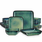
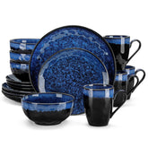
Trend reports from EKA Ceramic and Joyye describe reactive glazes, earthy matte finishes, organic shapes, and bold color blocking. Reactive glazes, where kiln chemistry creates unique, one-of-a-kind patterns, have become a signature feature for stoneware dinner plates in cobalt blue, caramel brown, and deep forest green. These designs especially appeal to Gen Z and millennials who want uniqueness and strong visual branding in their tableware. The key selling points are individuality, camera appeal, and lifestyle fit, not whether the plate is “for him” or “for her.”
On the production side, companies like Vibrantz Technologies are pushing the technical envelope. Their ceramic glazes and digital printing inks offer an almost limitless spectrum of colors, including a seven-color system in ceramics (CMYK plus RGB) that allows faithful reproduction of complex images and patterns on bone china, porcelain, earthenware, and stoneware. The focus here is durability, dishwasher resistance, lead-free pigments, and a broad chromatic range for brands who want their plates to tell intricate visual stories. Still no talk of inherent femininity or masculinity in any specific hue.
Even color selection is becoming more data-driven. A research paper on ceramic color design describes how engineers use perceptual semantics—people’s emotional words for color—and a neural network to map those feelings to measurable color values. They collected data on 310 ceramic glaze colors, then built a model that lets designers go from “I want this plate to feel calm and fresh” to specific CIELAB color parameters, and vice versa. That is a sophisticated, quantified way of designing color around emotions like calm, joyful, luxurious, or energetic. Gender does not appear on those semantic scales.
When experts in manufacturing, psychology, and design talk about color, they talk about mood, perception, durability, and sustainability. Gendered color feels, at best, like an outdated sideshow.

Pros and Cons of Ditching Gendered Color
If you are used to shopping “for her” collections and “for him” collections, dropping gendered color can feel like losing a shortcut. There are real pros and a few practical trade-offs.
The biggest advantage is creative freedom. Without gendered labels, you choose plates because they flatter your food, suit your space, and support the feelings you want at the table. Trend sources from Kim Seybert, Materials of Love, Joyye, EKA Ceramic, and Malacasa all encourage building a curated “wardrobe” of dinnerware: thoughtful combinations of neutrals, statement colors, and handcrafted textures that reflect your lifestyle and travels. That is much easier when you are not second-guessing whether deep forest green is “too masculine” or soft peach is “too feminine.”
Another major benefit is inclusivity. Gendered color assumes that every guest fits into a narrow pink–blue binary and that their taste must align with it. Gender-neutral palettes—whether they are airy whites and woods, earthy terracotta and moss, or vibrant dopamine decor sets—welcome everyone. Articles on gender-neutral wedding decor explicitly link neutral color strategy to making all guests feel equally at home; the same logic applies at Tuesday night dinner.
There is also practicality. Consumer preference research shows people increasingly favor mix-and-match sets, smaller collections, and open-stock replacement pieces. If your palette is built around moods and food types instead of gender categories, your plates work harder across occasions. White porcelain can handle a formal holiday roast and a weekday salad. Oxblood stoneware can anchor winter stews and summer grilled vegetables.
The main trade-off is that you lose easy marketing labels. For retailers, “his” and “hers” sets sell quickly, especially for gifting and weddings, because they are simple stories. For home buyers, those labels can reduce decision fatigue: you grab the set labeled for you and move on. Letting go of that shorthand means leaning into more thoughtful questions: how big is my table, how many guests do I host, what colors are my walls, how do I actually eat? The upside is that your answers are more honest and your tableware ends up being used and loved, not just on-brand for somebody else’s stereotype.

How to Build a Joyful, Ungendered Color Palette for Your Table
Let us get practical. Here is how I encourage clients—and myself—to choose ceramic tableware colors that are vivid, functional, and gloriously ungendered.
Start with a Neutral Canvas
Almost every expert source agrees on one thing: neutral plates are a powerful foundation. Kopin Tableware, PATRA, Get Serveware, Hancers, Loving Home, and multiple chef-focused guides all praise white or soft neutral dinnerware for its versatility. White, ivory, light gray, or warm beige plates let food colors pop, integrate with almost any table linen, and transition easily from casual breakfast to holiday dinner.
Think of these as your “base coat.” For many households, a set of stoneware or porcelain dinner plates in a neutral tone is enough to anchor daily meals. Stoneware, as defined by consumer preference research, is high-fired, durable, non-porous enough for everyday use, and often sports rustic, speckled glazes that add texture without shouting. Porcelain and bone china offer a more refined, sometimes translucent look while remaining surprisingly strong and suitable for both everyday and formal settings.
None of these materials demand a gender label. They ask one question: do you want rustic and cozy, or crisp and refined?
Layer Mood Colors, Not Gender Colors
Once your neutral base is in place, you can play. Salad plates, dessert plates, and serving bowls are perfect vehicles for personality. Instead of thinking “feminine” or “masculine,” think in terms of feelings and functions.
Warm colors like red, terracotta, mustard, and amber are brilliant for celebratory meals, hearty comfort food, and cold-weather gatherings. They echo fall leaves, baked crusts, and candlelight. Color psychology sources from Malacasa, PATRA, Hancers, and Joyye’s trend report all connect warm palettes with energy, appetite, and emotional warmth.
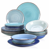
Cool tones like sage, eucalyptus, aqua, and deep petrol blue excel at relaxed brunches, seafood spreads, and summer evenings. They read fresh and airy. Materials of Love and Italian Pottery both highlight muted greens and deep ocean blues as core to 2025’s nature-inspired, calming tableware.
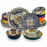
Bold “dopamine decor” colors—cobalt rims, sunny yellow bowls, oxblood serving platters—bring instant joy. Joyye, Kim Seybert, and EKA Ceramic all note a shift toward expressive color in 2025: color blocking, contrasting rims, and jewel tones used as accents rather than full sets. These pieces are delightful precisely because they defy the old “neutral equals serious” rule, not because they belong to a specific gender.
Think About Food First
One of the easiest ways to escape gendered thinking is to ask a food-first question: what will I actually serve on this plate?
If your repertoire is full of beige foods—roast chicken, potatoes, cream-based pasta—Get Serveware suggests using darker plates like black or brown to provide contrast and make those dishes look richer and more intentional. For vibrant tomato-based dishes or red meats, white plates are reliable frames; pairing red foods with green plates, which are complementary on the color wheel, creates dramatic, restaurant-quality contrast.
If you are trying to support portion awareness or weight management, the Cornell University findings summarized by Kopin Tableware and the Oxford studies referenced by Malacasa and PATRA point you toward high-contrast combinations and possibly cooler or darker plates that make portions look more generous. If you are nourishing someone with a low appetite, bright yellow or warm-toned plates, as noted in Kopin Tableware’s coverage of Alzheimer’s research, can subtly encourage greater intake.
None of these questions require you to identify the diner’s gender. They require you to know the menu and your goals.
Use Color for Clever Functions
Strategic color is a quiet powerhouse in hospitality and caregiving. Kopin Tableware describes restaurants using vivid plate colors to code allergens—blue for gluten-free, for example—so servers and guests can see at a glance which dishes must not be swapped. Malacasa and PATRA emphasize that high-contrast plates help people with cognitive or visual impairments distinguish their food more clearly, aiding both independence and nutritional care.
At home, you can borrow the same logic. One set of intense cobalt plates might be the “kids’ snack plates,” designed to make vegetables and whole grains look more exciting. A set of calming slate gray plates could be your evening set if you are trying to slow down late-night eating.
These are delightfully pragmatic uses of color. Gender, again, is irrelevant.
Curate a Mix-and-Match Wardrobe
Trend articles from Kim Seybert, Materials of Love, Joyye, Malacasa, and the broader 2025 dinnerware landscape all celebrate the move away from rigid matching sets toward curated, mix-and-match tables. You might pair a rustic stoneware dinner plate with a fine bone china salad plate and a hand-painted earthenware bowl, unified by a shared palette of, say, forest green and cream. You might layer classic blue-and-white porcelain with a single oxblood centerpiece bowl, as Joyye suggests, for a fresh spin on tradition.
Consumer preference data shows that shoppers increasingly buy smaller sets, favor open-stock pieces, and prioritize stackable, space-saving designs. Thin, stackable plates with standardized dimensions, as EKA Ceramic notes, make life easier for urban kitchens and hospitality venues. When your palette is mood-based rather than gender-based, these pieces can flow across occasions without feeling out of place.
An eclectic, color-smart table has one thing in common: it tells your story, not a marketer’s story about who should like which hue.

FAQ: Color, Gender, and Your Plates
Is it “wrong” to love pink plates?
Not at all. The problem is not pink, it is the assumption that pink belongs only to women. If you adore a blush reactive glaze, build a table around it: layer it over deep forest green stoneware, or pair it with crisp white and warm wood. When color becomes a personal joy choice instead of a gender assignment, everyone wins.
What if my guests still read certain colors as gendered?
You cannot rewrite decades of cultural conditioning in one dinner, but you can gently nudge the narrative. Instead of explaining your table as “girly” or “masculine,” talk about mood and story: harvest-inspired, seaside, gallery-chic, forest supper. Over time, guests start associating those palettes with experiences rather than gender, much like the gender-neutral wedding decor advice that prioritizes story and comfort for all guests.
How do I manage multiple color palettes in a small kitchen?
Lean into what EKA Ceramic and consumer preference studies suggest: stackable, thin plate profiles and a core neutral base. Store one neutral set that works with everything, then rotate a small number of accent pieces by season: maybe oxblood and gold accents in winter, sage and sand in spring. You do not need twelve different collections; you need a smart mini-wardrobe of pieces that mix and match without clashing.

A Colorful Closing
Ceramic tableware has never been more exciting. Reactive glazes, oxblood centerpieces, dopamine-bright rims, quietly luxurious bone china, and data-informed color design are all reshaping how we eat with our eyes. In all of that innovation, “pink for her, blue for him” is not just outdated; it is irrelevant. When you choose colors for appetite, mood, function, and story, your plates stop performing gender and start performing joy. And that, from one colorful tabletop joy curator to another, is the only performance that really matters at your table.
References
- https://pmc.ncbi.nlm.nih.gov/articles/PMC9322515/
- https://www.mydomaine.com/colorful-cookware-trend-5181039
- https://ceramamadinnerware.com/Dinner_Plates/5854.html
- https://theartisanemporium.co.in/mastering-ceramic-colors-a-practical-guide-to-choosing-your-palette/?srsltid=AfmBOoqxyXMA1DfbhZB--PkhNDTEftSbySx-ULvnKxwM7nN1OJX4wzjT
- https://ekaceramic.com/6-design-trends-in-ceramic-dinner-plates-for-2025/
- https://fennhome.com/mastering-ceramic-tableware-a-comprehensive-guide-to-craftsmanship-and-production/
- https://www.getserveware.com/how-using-color-dinnerware-affect-food-presentation/
- https://www.joyye.com/info-detail/ceramic-tableware-color-trends-in-2025
- https://www.lovinghomecollection.com/how-to-choose-dinnerware-color/
- https://www.hancers.com/blog/the-importance-of-colors-in-ceramic-dinnerware-sets-for-different-occasions/


