

A lot of people buy plates because the shape looks nice or the set is on sale. Later, the color feels wrong in daily use. Food can look dull, the table can feel too busy, and the set may stop matching the room after a small decor change. That is why tableware colors deserve real thought before you buy. The right choice makes meals look better, works with your home, and still feels current after years of use.
Why Tableware Color Matters in Everyday Dining
Tableware color affects how your table looks and feels every day. It can change how food stands out, how easy the set is to match with your home, and how practical it feels in regular use.
Some colors are easier to live with than others. White, ivory, beige, muted green, and dusty blue usually work well because they are flexible and fit many different meals and home styles. They also feel appropriate for both everyday dining and casual gatherings.
Plate color can also change food presentation. In general, food tends to stand out more clearly on plates that create enough contrast. That is one reason light neutral colors are often a safe and practical choice.
How to Choose Tableware Colors Based on Your Home Style
A good set should feel like part of the home. If the plate color clashes with the cabinets, counters, walls, or textiles, the table will always look slightly off. So before you compare finishes or shapes, look at the room first. The most practical tableware colors are usually the ones that echo the space without copying every color in it.
Modern and Minimal Homes
Homes with clean lines, black accents, cool stone, and simple surfaces usually work best with crisp white, warm white, charcoal, mushroom, or matte black. These shades keep the table clean and controlled. If the room already has a strong contrast, warm white is often easier than bright white because it softens the overall look.
Warm and Natural Interiors
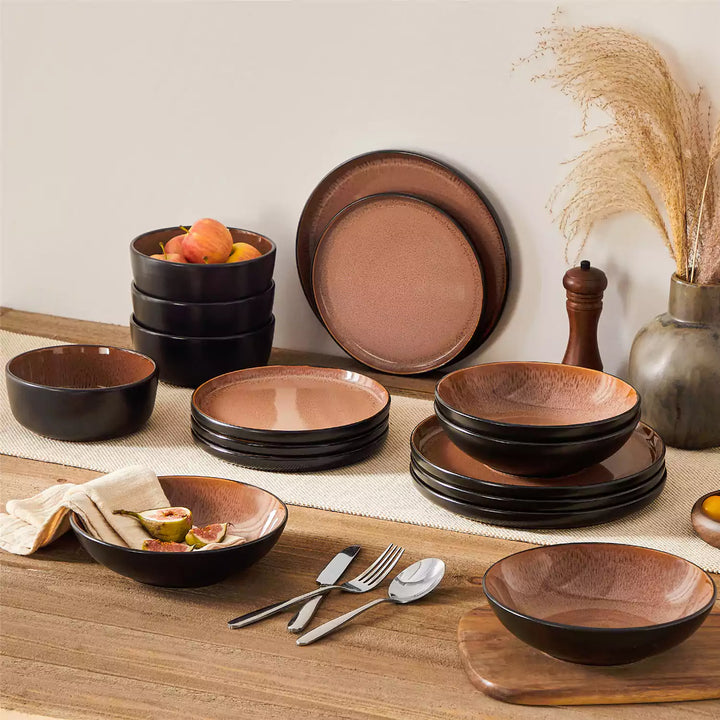
Spaces with oak, walnut, linen, terracotta, beige walls, or woven textures usually pair well with cream, sand, taupe, clay, muted olive, and earthy brown. These colors feel grounded and stay visually calm. They also help the table feel cohesive without looking overstyled.

Japandi and Scandinavian-Inspired Rooms
If your home leans simple, calm, and functional, stay close to warm neutrals, soft gray, greige, dusty blue, and muted green. These tones support natural wood and light textiles. They also age well because they are quiet and easy to pair with future decor changes.
Traditional or Transitional Spaces
Classic homes can usually handle a little more depth. Ivory, dusty blue, deep green, soft navy, and muted burgundy often look appropriate here. These shades add character, yet they still feel stable enough for long-term use.
The safest match is not always the lightest or the trendiest one. It is the one that fits the materials already in your home.
Best Tableware Colors for Daily Use and Special Occasions
Once the room is clear, the next question is use. Most households need one dependable core set and, if desired, a few accent pieces for guests or holidays. That makes the buying decision easier and keeps tableware colors practical.
| Color | Best Use | Why It Works | Possible Drawback |
|---|---|---|---|
| Warm White | Daily meals | Clean, flexible, easy with most foods | Can feel sharp in very warm spaces |
| Cream or Ivory | Daily meals and casual hosting | Softer than bright white, easy to style | Yellow undertones may feel dated in cool kitchens |
| Soft Beige or Taupe | Daily use | Hides wear well, blends with wood and stone | May mute pale foods |
| Muted Green / Dark Green | Daily use and relaxed hosting | Calm, natural, works with many interiors | Dark greens can reduce contrast for salads |
| Dusty Blue | Daily use and weekend hosting | Classic, easy with neutral decor | Cool tones can flatten some cool-toned foods |
| Matte Black | Dinner parties | Strong contrast, dramatic look | Shows marks and scratches faster |
| Deep Red, Rustic Red, or Burgundy | Holiday hosting | Warm, festive, rich | Feels seasonal if used as a full set |
| Brown or Clay | Everyday use in warm homes | Grounded, forgiving, easy with rustic decor | Needs enough food contrast |
| Navy Blue or Deep Indigo | Daily use and evening hosting | Richer than dusty blue, elegant with neutral decor, works well in traditional and transitional homes | Can reduce contrast for dark foods or cool-toned dishes |
| Teal or Turquoise | Weekend hosting and spring-summer tables | Fresh, expressive, works well with light meals and relaxed settings | Brighter tones can feel less timeless as a full set |
| Grey or Light Grey | Daily use in modern homes | Calm, flexible, easy with black, white, and wood tones | Very pale foods may look flatter on cooler greys |
| Terracotta | Warm homes and seasonal hosting | Earthy, grounded, strong with rustic and natural interiors | Can feel heavy in cool kitchens or when overused |
For daily meals, warm white, cream, beige, taupe, and muted green are often the strongest choices. They handle a wide range of foods and do not lock you into one mood. For special occasions, richer shades such as matte black, deep green, burgundy, or brown can work well in accent pieces.
If you only want one full set, daily use should carry more weight than holiday style. A neutral base is usually the smarter investment. You can always add color through serving bowls, napkins, glasses, or salad plates later.
How Different Tableware Colors Affect Food Presentation
The plate looks beautiful on its own, but meals do not look as good once they are served. That happens because food presentation depends heavily on contrast, tone, and visual balance. Good tableware colors make food easier to see and easier to enjoy.
Light Neutrals
White, ivory, and soft cream are usually the most flexible options for food presentation. They work especially well with colorful dishes such as berries, salads, eggs, tomato-based pasta, grilled vegetables, and fruit desserts. These plates let the ingredients stay in focus.
Dark Colors
Black, charcoal, and very deep brown can look striking. They work best with pale foods such as mashed potatoes, risotto, white fish, creamy pasta, and light desserts. They are less useful for dark sauces, roasted greens, chocolate cakes, or beef stews because the dish can lose definition.

Warm Earth Tones
Clay, rust, brown, and beige give the table a softer and warmer feel. They pair especially well with breads, soups, grain bowls, roasted foods, and comfort meals. These colors are appealing in real homes because they feel relaxed. On the other hand, they may reduce the brightness of very pale or very colorful dishes.
Blue and Green Tones
Blue and green plates can look calm and sophisticated, especially in homes with natural materials. They are best used with enough contrast. Soft blue works well with pastries, salads, and light entrees. Green works nicely with neutral foods, grains, and white sauces. If the dish is already green or cool-toned, the plate may make it look flatter.
Food usually looks best when the plate color helps the ingredients stand apart clearly. That is the simplest way to judge a plate in real life.

How to Mix and Match Tableware Colors Without Looking Messy
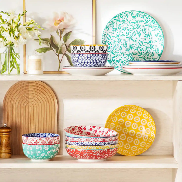
Many people do not want a fully matched set. That is understandable. A mixed table can feel warmer and more personal. The problem comes when there is no structure. Then the result looks random. If you want mixed tableware colors, keep the palette controlled.

Use a three-part system:
- One base color for dinner plates
- One supporting color for bowls or salad plates
- One accent color for serving pieces or seasonal items
That structure keeps the table organized and gives you variety without confusion.
Here are a few combinations that work in most homes:
- Warm white + muted green + brown
- Cream + dusty blue + charcoal
- Sand + olive + terracotta
- Ivory + navy + soft pink
Finish matters here too. If one piece is glossy, another is matte, and another has a heavy reactive glaze, the table can feel visually crowded. Similar textures usually create a cleaner result.
Undertones also need to stay aligned. Warm neutrals pair better with olive, clay, rust, dusty blue, and warm brown. Cool whites and cool grays pair better with black, slate blue, and cooler greens.
A mixed table looks intentional when one color leads and the others support it.
Common Mistakes to Avoid When Choosing Tableware Colors
Most tableware color mistakes come from focusing too much on appearance and too little on practicality.
Picking a Trend Color Without Looking at the Room
A fashionable color can still feel wrong in your kitchen. If it clashes with cabinets, backsplash, or flooring, the table will always look disconnected.
Ignoring Undertones
White can lean cool, warm, pink, gray, or yellow. Beige can do the same. If the undertone does not fit the room, the plate may look dull or slightly dirty even when it is clean.
Choosing Only Dark Plates
Dark dinnerware photographs well and can look elevated. Still, it often shows marks faster and works with fewer foods. A full dark set is harder to use every day than many buyers expect.
Treating Color Advice Like a Fixed Rule
General patterns can help, yet no color works the same way in every setting. Lighting, food color, finish, and room tone all matter. A safe color can fail in the wrong environment, while a bold color can look excellent when the contrast is right.
Buying for One Season
Deep red, forest green, and strong holiday tones can be attractive during part of the year. They may feel limited in spring or summer. If you want a set that lasts, choose a stable base and use seasonal color in smaller pieces.
The best buying decision usually comes from daily use, not from a holiday table photo.
Pick a Tableware Color That Stays Stylish Over Time
If you want a tableware color that lasts, choose one that feels easy to use in daily life and easy to match with your home. For most people, warm white, cream, beige, taupe, muted green, and dusty blue are the safest options. These shades work well across different meals, seasons, and decor styles. A timeless choice should stay practical, look clean on the table, and still feel right after your home changes over time.
Common Questions About Choosing Tableware Colors
Q1: Do Matte and Glossy Finishes Change How Tableware Colors Look?
Yes. Matte finishes usually make colors look softer and more muted, while glossy finishes reflect more light and make colors appear brighter and sharper. If you are deciding between the two, check the finish under both daylight and evening light before buying a full set.
Q2: Which Tableware Colors Work Best in Small Dining Spaces?
Light to mid-tone colors usually work best. Warm white, cream, soft beige, and pale gray can help a small dining area feel cleaner and less visually crowded. Very dark or highly saturated colors may feel heavier, especially when the room already has strong colors or dark surfaces.
Q3: Are Patterned Plates Harder to Style Than Solid Colors?
Usually, yes. Patterned plates can look attractive, but they are often less flexible than solid colors and may compete with food presentation. A practical approach is to keep dinner plates simple and use patterns on salad plates, dessert plates, or serving pieces for added interest.
Q4: How Many Colors Should You Use in One Table Setting?
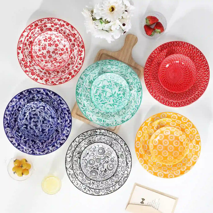
For most homes, two to three colors are enough. One main color keeps the table cohesive, a second adds contrast, and a third should be used lightly as an accent. For example, you can start with softer base tones like White, Cream, Beige, Grey, Light Grey, or Soft Blue, then add contrast with Navy Blue, Dark Blue, Sea Blue, Teal, Green, Dark Green, Jade, Brown, Terracotta, or Deep Indigo. If you prefer a more expressive look, Multicolor, Gradient Green, Macaron Colors, Bohemian Colors, Bold Vibrant Colors, Rich Colors, Serene Blue, Rustic Red, or Vibrant Green usually work better as accent pieces rather than a full table setting. Using too many colors at once can make the setting feel busy and harder to style well.
Q5: Should You Match Tableware Color to Your Countertops or Cabinets?
No. It is better to match the undertone than the exact color. Plates do not need to copy your cabinets or countertops. They should simply feel compatible with the room. Warm kitchens usually work better with warm neutrals, while cool kitchens suit cooler whites, grays, and blues.