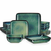
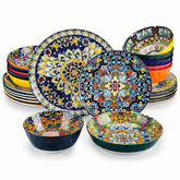
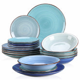
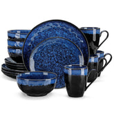
Coding in Color: Harmonizing Mechanical Keyboard Colorways and Ceramic Mugs for a Joyful, Efficient Desk
Color is not a garnish on a programmer’s desk; it is a quiet system that keeps focus steady and spirits bright during long sessions. The right keycap palette can make legends snap into clarity and make code feel less like a grind, while a complementary ceramic mug turns micro‑breaks into small rituals that reset the brain. Over years of curating “color‑first” setups for dev teams and creative studios, I’ve found that the most satisfying desks treat keyboards and mugs as a single canvas. This guide brings together practical color theory, hardware realities, ceramic know‑how, and care tips so you can create a cohesive, durable, and genuinely useful desk aesthetic.
Why Color Matters at the Desk
Color affects perception and productivity in subtle but repeatable ways. Enthusiast resources on keycap colors emphasize that hues shape mood and creative energy, and that choosing sets aligned to a target feeling can refresh daily typing experiences while keeping legends readable. Color psychology basics are helpful here: blues tend to read calm and focused, reds feel urgent and energetic, greens suggest balance and endurance, and clean whites tame visual clutter. Gaming and peripherals sources echo the same principle, noting that lighting and exterior styling influence comfort, immersion, and even the sense of control over long sessions. This is not mysticism; it is purposeful environment design that frames how you enter and stay in a flow state.
When your keyboard and mug are planned together, the color story gets stronger. A cool, restrained board with a saturated accent can gain warmth from a matte stoneware cup, while a bold Miami‑style keyset snaps into sophistication next to a glossy black mug. The trick is to translate color theory into desk‑ready decisions that also respect legibility, switch feel, heat and wash safety for ceramics, and daily maintenance time.

Color Theory, Simplified for Keyboards and Cups
Design educators consistently recommend a handful of dependable harmony families. Across practical guides from PicMonkey and Flux Academy, the principles are consistent enough to operationalize.
Scheme |
What it means |
When to use it |
What to watch |
Analogous |
Neighboring hues on the wheel |
Calm, coherent setups that “just match” |
Can get sleepy; add a contrasting accent or a textured mug glaze |
Complementary |
Opposites on the wheel |
High contrast, energetic focus pops |
Can glare; balance with mid‑tones or neutrals |
Split‑Complementary |
Base hue plus neighbors of its opposite |
Flexible contrast with less tension |
Keep one color dominant to avoid noise |
Triadic |
Three evenly spaced hues |
Playful, modern palettes with balance |
Set a primary; keep the other two as accents |
Tetradic |
Two complementary pairs |
Max versatility in seasonal swaps |
Manage warm vs cool balance to prevent clashes |
Two more levers matter on a developer’s desk. First, temperature: warm colors feel closer and energizing, while cool colors recede and calm; modulate this with your deadlines and your room’s lighting. Second, tone control: add white to soften (tints), black to deepen (shades), and gray to quiet intensity (tones). Most desks look and work best when intense colors are limited to accents that guide the eye. Neutrals like white, gray, and black remain crucial for structure, especially on legends and ceramic exteriors.
Academic color harmony research also offers a useful sanity check. Work published in Color Research & Application by Hsiao and colleagues models aesthetic balance as a relationship between order and complexity, and includes an area rule of thumb: when one color is darker or less vivid, it can occupy a larger area to keep harmony stable. On a desk, that translates to a darker board paired with a larger light‑toned mug, or inversely, a bright, patterned mug next to a keyboard with restrained alphas.

Proven Keyboard–Mug Pairings That Just Work
Community favorites supply a ready palette library. The Keeblog documents colorways like Dolch, 9009, Granite, and Godspeed, all of which have inspired artisans and manufacturers for years. Cerakey’s survey of twenty color schemes adds vivid ideas ranging from Miami’s cyan with pink to EVA‑01’s purple with apple green and orange, plus practical notes about profile and row compatibility when mixing sets.
To help you translate those into tabletop harmony, here are reference pairings and why they behave well under real lighting.
Keyboard colorway (source) |
Matching mug glaze or finish |
Mood and rationale |
Dolch: charcoal with gray accents (The Keeblog) |
Matte white or warm off‑white stoneware |
Neutral anchor for legibility with a soft, inviting coffee ritual |
9009: beiges with muted red/green accents (The Keeblog) |
Glossy forest green or brick red |
Vintage calm with a single saturated mug accent for focus |
Carbon: ivory, black, orange (Cerakey) |
Glossy black with a small orange decal or rim |
High contrast typing; the mug carries the accent without overwhelming legends |
Miami: cyan and pink (Cerakey) |
Frosted white or very pale pastel |
Bold board gets air to breathe; the mug calms the scene while staying playful |
EVA‑01: purple, green, orange (Cerakey) |
Deep purple satin glaze |
Cohesive theme; matching the primary hue on the mug keeps the desk from fracturing |
Gray and white with red Escape (Cerakey) |
Classic red diner‑style mug |
A single red echo between board and cup centers attention without glare |
Sunset‑inspired brights (WASD Keyboards post) |
Matte charcoal |
Saturated board needs a grounding neutral to reduce fatigue |
Try evaluating these under your actual lighting rather than showroom brightness. Sources focused on keyboard color point out that perceived contrast shifts with ambient light, so prototype at your desk before you commit.
Programmers’ Practical Constraints: Legibility, Layout, and Switch Feel
Even the most joyous palette has to serve the work. Color‑scheme guides for keycaps consistently stress readable legends, which generally means strong light‑dark contrast on alphas, a measured hand with novelty keys, and test typing under your everyday lighting. Creative gradients can work beautifully as long as legends never sink beneath the background. For backlit boards, many buyers find that calmer cap colors paired with clean, per‑key lighting give the most flexible day‑night performance; a number of users tune brightness to match room conditions to ease eyestrain, and utilities like OpenRGB exist for broader model control.
Switch feel and sound will not change the color math, but they change how long a palette remains comfortable because they influence fatigue and environment fit. Keychron’s switch color overview remains a helpful shorthand.
Switch color (example) |
Type |
Feel and loudness |
Typical use fit |
Red or yellow |
Linear |
Smooth, quiet to moderate; low force; fast |
Gaming focus or light‑touch typists |
Brown |
Tactile |
Noticeable bump; moderate noise |
Mixed coding and gaming; long sessions |
Blue |
Clicky |
Pronounced click; loud |
Typing joy, not for shared spaces |
Black |
Linear heavy |
Higher force; reduces accidental presses |
Control over speed; can fatigue |
Green or clear |
Clicky or tactile heavy |
Heavier actuation, stronger feedback |
Deliberate typing, sound‑tolerant setups |
Keep in mind that brand color codes vary slightly and that market guides emphasize trying a switch tester before committing. If you work in a shared office, balance the whole desk experience: quieter switches, subdued lighting, and a mug that does not draw attention may be kindest to neighbors.
Ceramic Mugs: Materials, Printing, Personalization, and Care
Durability and safety determine how far you can push color with mugs. HF Coors, a USA manufacturer based in Tucson, describes vitrified ceramic as high‑fired and non‑porous, which makes it resistant to staining, cracking, or crazing and safe for broiler, oven, microwave, dishwasher, and freezer use. Their pieces are lead‑free and come with a two‑year chip guarantee under normal use. That profile suits high‑color glazes you plan to run through a dishwasher daily and pairs well with workhorse boards that see long hours.
Customization methods change both color fidelity and care requirements. Merchandising guidance from EverythingBranded outlines a clear triangle. Sublimation printing transfers full‑color imagery and excels on white or light mugs; it is vibrant but typically less durable than other methods and costs more. Screen printing applies one ink per pass; it is tough and cost‑effective for simple marks and monochrome logos, ideal on black mugs with light ink. Laser engraving etches a permanent, high‑end mark but is monochrome only and often pricier. If your keyboard is visually busy, an engraved mug is a clean way to acknowledge the palette with subtlety.
At the craft and gift end, a hands‑on personalization guide proposes several budget‑friendly methods and includes curing instructions. Hand‑painting on a light cup with ceramic or enamel markers, letting layers dry between coats, and baking to set at about 350°F for approximately 30 minutes is a common approach; always defer to the exact paint manufacturer’s instructions. Transfers and decals are a viable path for crisper graphics: design digitally, print on ceramic transfer paper, apply without bubbles, then bake to permanently set. Care for most hand‑decorated mugs is hand wash only with mild detergent and no abrasive pads to preserve the finish. When you want full dishwasher reliability, factory‑fired glazes on vitrified stoneware are the safer route.
Capacity and comfort also affect your pairing. Wirecutter staff favorites include a 14 oz stoneware mug with many colorways and long‑term durability, as well as artisanal lines like Vietri whose 10 oz designs come in seasonal motifs. Branded 11 oz ceramic mugs remain the standard daily size; always verify the listing for microwave and dishwasher notes since third‑party sellers vary. If you like color variety across seasons, choose a shape with widely available color runs so you can swap the mug while keeping the board intact.

Building a Cohesive Desk Palette
Start with a mood anchored to the job at hand. If you write production code for long stretches, let the keyboard lead with neutral alphas and small, purposeful accents. If you spend afternoons pair‑programming and triaging bugs, a livelier cap set can keep energy up provided legends remain high contrast. Then choose the mug to reinforce or temper the mood. Guides to color theory make the translation straightforward. In an analogous setting like blue, blue‑green, and green, a teal mug with subtle speckle next to a blue‑tinted board reads serene and focused. In complementary settings like purple and yellow, let the keyboard own the purple with careful legends while a saffron rim mug adds the opposite as a smaller, cheerful pulse.
Room lighting matters more than catalog photos. Practical keyboard color advice and backlighting tutorials suggest matching brightness and hue to your environment to reduce eye fatigue, whether you prefer warm ambers in dim rooms or crisp whites in bright spaces. Apply the same logic to glazes: high‑gloss finishes can catch glare near a window, while matte and satin finishes absorb light and feel quieter.
Target mood |
Keyboard palette |
Mug choice |
Why it helps |
Calm focus |
Analogous cools: navy, teal, gray alphas |
Satin teal or matte white |
Cools recede; legibility stays strong while the mug softens the scene |
Energetic sprint |
Complementary: purple alphas, yellow accents |
Gloss white with yellow inner glaze |
Opposites spark attention while white blocks glare |
Vintage comfort |
9009 or Dolch neutrals |
Gloss forest green or brick red |
A single saturated mug adds warmth without harming legend contrast |
Playful creativity |
Miami cyan with pink accents |
Frosted or pastel white |
Bold board carries identity while the mug resets visual noise |
Minimal clarity |
Black on white or white on black |
Satin black or porcelain white |
High contrast structure keeps the space readable and timeless |

Budget, Availability, and Buying Tips
Keycap availability is a real constraint. The Keeblog’s walkthrough makes clear that many sought‑after sets are offered through group buys, and shipping can take months. Ready‑to‑ship boutiques exist at higher price points, and the community regards those sets as “boutique” for both quality and cost. If patience is not your virtue, focus on in‑stock vendors and classic colorways that rotate more often.
Profile compatibility matters when you match alphas and mods from different sets. Cerakey’s guidance is blunt: verify the keycap profile (OEM, DSA, SA) and the sculpted row mapping (R1–R4) before mixing, or keys will look and feel mismatched. When in doubt, buy a complete set in a colorway you love; the time savings and guaranteed fit usually outweigh the thrill of hunting one‑off colors. Ceramic keycaps do exist and bring a distinct feel and sound; install gently because ceramic is rigid and can chip, and double‑check MX‑style stem fit and layout coverage for 65%, TKL, or full size before purchasing.
On the mug side, match your finish to your maintenance tolerance and printing needs. Color merchandising sources recommend white mugs as the most flexible blank for full‑color graphics and black when you want a premium look with simple marks that stay bold. Sublimation loves white and intricate images; screen printing on black is durable for logos; laser engraving creates quiet luxury. For factory ceramics, HF Coors’ vitrified lineup is designed to tolerate dishwashers and microwaves; for craft pieces and personalized paints or decals, assume hand wash unless the maker confirms otherwise. If you gift mugs to a team, confirm capacity preferences; many developers prefer 14 oz for fewer refills during long focus blocks, while espresso drinkers will reach for smaller forms.

Maintenance and Everyday Ergonomics
Keyboards collect dust, hair, and skin oils that dull colors over time; enthusiast guides suggest periodic keycap pulls and gentle cleaning to keep legends crisp and surfaces even. Mechanical boards are louder and can develop keycap shine with heavy use; color will last longer if you avoid harsh cleaners and wipe routinely. Backlight profiles benefit from backup exports and restrained brightness to prevent eyestrain; users often match keyboard brightness to ambient conditions for comfort.
Mugs are simpler but deserve the same respect. Factory‑fired glazes on vitrified stoneware will largely shrug off dishwashers and microwaves. Personalized mugs made with markers, paints, or decals hold up better when washed by hand with non‑abrasive sponges. If you bake decorations to set them, follow the paint manufacturer’s instructions; 350°F for roughly half an hour is a common guideline in craft tutorials but does not replace the label on your product. Chips rarely happen with quality stoneware, but store mugs so rims do not knock against each other.
A Quick Decision Matrix
Scenario |
Keyboard color decision |
Mug decision |
Notes |
All‑day coding in a bright room |
High‑contrast legends, cool or neutral palette |
Satin white or soft cool glaze |
Prioritize readability and low glare |
Pair‑programming in dim lighting |
Calm alphas with limited accents, tuned backlight |
Warm matte glaze for a cozy feel |
Warmth helps morale without washing legends |
Presentation days |
Bolder mods with disciplined alphas |
Neutral mug that recedes |
Keep the stage clear; let code take focus |
Gift for a dev team |
Classic colorway with strong contrast |
Vitrified stoneware in brand color |
Reliable fit and dishwasher‑friendly mugs |
Takeaway
Treat your keyboard and mug as one color system. Use neutrals and strong legend contrast to protect readability, then add a controlled accent that the mug can echo or soften. Anchor choices in basic harmony schemes so they scale across seasons and projects, and test under your actual lighting so surprises disappear on day one. When you want custom graphics, choose methods matched to the finish and be honest about care; when you want set‑and‑forget durability, vitrified stoneware and well‑made keycaps are the sensible investments. Small decisions add up to a workspace that feels like yours and works like a tool.
FAQ
Q: What color rule matters most for a coding keyboard that I use eight hours a day? A: Legend contrast under your real lighting is non‑negotiable. Start with high‑contrast alphas and introduce accents on a few mods; if you need more color, let the mug carry it so readability never suffers.
Q: How do I keep a bold colorway from feeling loud or fatiguing after a week? A: Balance with neutrals and control tone. Use tints, shades, or matte finishes to soften intensity, and pick a mug in a calming satin or matte glaze to absorb glare. Color theory references describe analogous mixes and toned accents as dependable ways to keep energy without visual noise.
Q: Are ceramic keycaps practical for daily use? A: They can be, with care. Ceramic brings a distinct feel and sound, but it is rigid and can chip if forced onto stems or dropped. Confirm MX stem fit and layout coverage, install gently, and clean with non‑abrasive methods.
Q: What is the safest way to personalize a mug for a team gift? A: For full‑color graphics at scale, use white mugs with sublimation or screen printing depending on design complexity. For premium longevity, laser engraving offers durable, monochrome marks. If hand‑decorating, follow paint instructions and expect hand‑wash care.
Q: How do I choose a mug color that plays nicely with a vintage keyboard palette like Dolch or 9009? A: Pair neutrals with a single saturated accent. A matte or glossy green, brick red, or deep blue mug complements beige and gray classics beautifully and keeps the desk cohesive without reducing legend clarity.
Q: Do lighting and backlight profiles actually affect comfort, or is it just aesthetics? A: They affect comfort. Practical guides and user reports note that tuning brightness and hue to match room conditions eases eye fatigue. Warm ambers in dim rooms and crisp whites in bright spaces are common, comfortable choices when combined with restrained per‑key effects.
Sources and Notes
This guide integrates practical color frameworks from Flux Academy and PicMonkey, community colorway knowledge from The Keeblog and Cerakey, switch behavior guidance from Keychron, desk‑level aesthetics insights from VGN, RGB and maintenance notes from MelGeek Lab, ceramic durability and safety details from HF Coors, customization method tradeoffs from EverythingBranded, everyday mug preferences from Wirecutter staff picks, and craft personalization practices including curing guidance from a ceramic cup gift tutorial. An academic perspective on color harmony measurement and area balance comes from Color Research & Application. Anecdotal palette prompts were inspired by posts from WASD Keyboards and the KeebTalk community.
References
- https://www.academia.edu/81361342/An_aesthetic_measurement_method_for_matching_colours_in_product_design
- https://www.loveramics.com/
- https://smart.dhgate.com/creative-and-easy-methods-to-customize-your-keyboard-color-for-any-setup/
- https://www.everythingbranded.com/blog/what-color-custom-mug-is-best-for-customizing
- https://www.flux-academy.com/blog/what-is-color-theory
- https://www.lemon8-app.com/@iretrolab/7493436149860647470?region=us
- https://www.picmonkey.com/blog/color-theory-choosing-the-best-colors-for-your-designs
- https://thekeeblog.com/colorways/
- https://www.amazon.com/CafePress-Monitor-Keyboard-Ceramic-Coffee/dp/B0D2WG9924
- https://www.cerakey.com/blogs/news/20-recommended-color-schemes-of-the-mechanical-keycaps?srsltid=AfmBOoprhqaB8mQXzrseDD1UayoDf_RPDgwfkxv6zbiW2O2QV9ouZppO


