Understanding Ceramic Tableware Colors and Circadian Rhythms for Pilots
Pilots live by clocks that don’t always line up with the sun, so mealtime can feel like a moving target. That is exactly why a colorful tabletop matters. Plates and bowls are not just props; they are practical tools that can nudge appetite, calm a wired mind after a night leg, or make a 4:30 AM oatmeal feel like a small celebration before pushback. As a Colorful Tabletop Creative & Pragmatic Joy Curator, I design with two north stars: make the food look irresistible and make the moment fit your internal tempo, even when your schedule says otherwise. Think of this as a cheerful, research‑guided field manual for pilots who want their ceramic tableware to work smarter for both taste and timing.
What Research Really Says About Color, Shape, and Taste
The psychology of tableware is surprisingly robust, and it begins with how our eyes steer our expectations. A study reported in Flavour Journal in 2013 served the same cheesecake on different plates and found that white round plates boosted perceived sweetness and flavor intensity compared with black plates, with shape also playing a role. Artists and chefs often call the white plate a blank canvas; the food pops, and the brain expects clarity and balance. That impulse shows up elsewhere too. The Culinary Pro notes that white plates tend to amplify sweetness, black plates are read as more savory forward, and red plates have been reported to reduce how much diners eat. These are not magic spells. They are visual cues that nudge a first impression before a single bite.
Shape and size matter as well. The Delboeuf illusion tells us that the same portion looks smaller on a larger plate and larger on a smaller one. Real‑world data underline this bias: participants poured 9.9% more soup into larger bowls and 8.2% less into smaller bowls. For anyone trying to avoid over‑eating after a fatiguing duty day, or for crew who struggle to eat enough when appetite is suppressed by jet lag, plate and bowl size is more than décor—it is a behavioral tool.
Color also links to flavor expectations. When the hue of a beverage or plate breaks the brain’s automatic food–color associations, people can misjudge what they are tasting. Oxford University–cited work referenced by several tabletop sources echoes this broader insight: contrast is king. High contrast between food and plate sharpens perceived detail and can boost how appetizing a dish appears. Put simply, a pale seafood stew on a deep slate bowl looks brinier and more defined than the same stew on a taupe plate where it visually blends in.
A final point from the craft side: finish and surface texture change how color reads. Glossy glazes intensify saturation and highlight shine. Matte glazes soften bold tones and hide minor scratches but can show oil stains if neglected. In tasting sessions I run with pilots and chefs, I reach for white or pale satin plates when I want fruit and dairy sweetness to sing, and darker or matte pieces when I want greens, grains, or steak to feel deeper and more grounded. My anecdotal bias happens to mirror the published patterns.

Definitions You Can Use in the Galley or Break Room
Color balance is the purposeful selection of hues so food feels harmonious rather than chaotic. Contrast is difference—light against dark, smooth against crisp, round against square—used to make a focal point pop. Composition is the intentional arrangement of components and negative space so the eye knows where to look first. These are standard art principles that chefs and caterers apply daily and are described clearly by professional resources such as The Culinary Pro and modern catering guides.
The Delboeuf illusion is a size‑perception bias in which the same portion looks smaller on a larger plate, encouraging over‑serving, and larger on a smaller plate, discouraging it. A reactive glaze is a kiln‑fired ceramic finish where color variegates in the heat, creating unique, often moody patterns that look phenomenal on camera and in person.
Circadian‑Savvy Tableware Strategy for Pilots
Let’s be clear and practical. There is no controlled study in the sources here proving that plate color resets circadian biology. Instead, we have repeatable visual‑psychology effects around appetite, flavor expectation, and portion judgment. That is more than enough to design helpful cues for real life in early call times, red‑eye recoveries, and long‑haul layovers. Use color and size to support the kind of meal your body needs at a given point in your duty cycle, and use finish to dial the mood up or down without changing the food.
Situation |
Desired Nudge |
Helpful Color/Finish |
Study‑Supported Clue |
Size Cue |
Pre‑dawn briefing breakfast when appetite is flat |
Encourage gentle appetite and make simple food feel brighter |
White or warm‑toned plate with a satin or light gloss |
White plates boost perceived sweetness and intensity; warm hues read as inviting (Flavour Journal; The Culinary Pro) |
Slightly smaller plate to make portions look substantial |
Cruise‑phase meal when you want calm focus |
Keep arousal steady and avoid sensory overload |
Cool‑toned plate (soft blue or green) with matte finish |
Cool hues are associated with calm and can reduce appetite cues; matte softens boldness (Vancasso citing NIH; finish guidance from industry sources) |
Standard plate, avoid oversized bowls |
Post red‑eye recovery lunch when you need appetite to rebound |
Entice eating without overdoing portions |
White or vivid, high‑contrast plate with glossy rim |
High contrast increases visual “pop” and perceived quality; white helps sweetness cues (The Culinary Pro; Flavour Journal) |
Medium bowl with defined lip to contain sauces and signal a complete portion |
Layover dinner when eating late local time |
Moderate portions and avoid a heavy feel |
Dark or slate plate to emphasize savory depth without dessert‑style sweetness |
Dark plates push savory expectation; lower brightness can temper indulgence cues (The Culinary Pro) |
Smaller dinner plate to counter the Delboeuf illusion |
Treat this as a cockpit checklist for the table: choose color for mood, size for portion control, finish for intensity, and keep contrast working in your favor.

Color Playbook: Pairing Plates and Food So Everything Looks Delicious
Contrast is the oldest trick in plating and it still works. Neutral proteins and beige sides—think roast chicken, mashed potatoes, cream sauces—spring to life on dark plates where the edges and textures become visible. Red foods such as tomato sauces and beef read juicier and more dimensional on white. Bright yellow and orange foods like eggs, corn, and spiced curries feel vivid and well‑defined against blue. Green foods such as pesto, salads, or guacamole can harmonize on yellow or green dinnerware for a fresh, cohesive look, or pop against white if clarity is the goal. These pairings align with guidance from The Culinary Pro and are echoed by presentation educators and styling guides such as GetServeware.
Composition adds structure. A pale puree with a charred steak, crisp onions, and a little green micro‑herb creates color, texture, and height contrast in one move. Plates with square geometry can make round or oval foods feel more graphic, while round plates offer classic harmony that stacks naturally with bowls in tight galley spaces. Negative space matters too. Leaving some plate visible lets the eye rest and frames the food, an approach common in fine dining and professional catering literature because it reads as confident rather than sparse.

Finish, Texture, and Material: The Feel in Your Hands Matters
Finish sets the emotional temperature of the table. Gloss is lively and photogenic. Matte is calm and tactile. Satin lands in the middle and is a favorite for day‑to‑day resilience. Industry advice collected by Smart DHgate notes that glossy surfaces show glare and tiny scratches more readily but clean easily, matte hides wear but can stain if neglected, and satin offers balanced sheen.
Material drives durability. Everyday ceramic choices include porcelain, stoneware, and earthenware. Porcelain is dense and polished looking, often noted for chip and crack resistance and tolerance for higher heat in daily use. Stoneware is a heartier, slightly thicker option with excellent durability and a rustic appeal. Earthenware feels warm and artisanal but is generally less durable than stoneware. Multiple buyer’s guides for everyday dinnerware point out that microwave‑safe and dishwasher‑safe labels are practical must‑haves; as a rule, avoid pieces with metallic trims or gold accents in the microwave, a safety note underscored by manufacturers such as EKA.
Even mugs deserve a thought. Research roundups from household guides report that tall, narrow mugs hold heat and concentrate aroma, wide mugs make beverages read sweeter, and squat shapes can emphasize perceived bitterness. If you rely on a coffee ritual to mark your body’s clock on a shifting schedule, it is a tiny but surprisingly effective piece of sensory choreography.
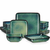
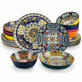
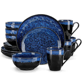
Reactive glazes and textured ceramics are the style heroes of the current moment. Reactive glazes create one‑of‑a‑kind looks that flatter cozy nighttime meals and bold brunches alike. Textured patterns catch light and add tactile delight, though deep textures may hold on to spice oils if not cleaned with care.

Buying for the Crash Pad, the Crew Room, and Home
Build from a neutral base and add accents that earn their keep. A set of white or pale gray plates and bowls is endlessly versatile and aligns with the sweetness‑enhancing, contrast‑boosting benefits reported in Flavour Journal and by The Culinary Pro. Layer in a cool‑toned set for calmer meals after late flying, and one warm‑toned accent set for when you want to wake up a plate without relying on extra sugar or salt. Choose plate sizes that match typical portions so the Delboeuf illusion works for you rather than against you. Dinner plates in the 10–12 in range are practical; salad plates in the 6.5–9 in range stack well and double as breakfast or snack plates. Bowls should be deep enough for stews and pastas but not so large that every pour becomes accidental seconds.
If you are starting fresh, complete place settings make coordination easy, but sets of four by item let you tailor to how you actually eat. If your week revolves around salads and soups between legs, invest in bowls with a comfortable lip and a finish that hides light utensil marks. If you entertain, a dozen salad plates can transform snacky, sunset‑timed layovers into a casual tasting that still feels pulled together.
Look for pieces labeled dishwasher‑safe and microwave‑safe. If you prefer matte, pick darker tones or lightly speckled glazes that mask oil traces, and wash promptly after tomato or curry sauces. Run your hands along rims and undersides; rounded profiles chip less in shared sinks. If you buy patterned or colored pieces, ask reputable sellers to confirm lead‑ and cadmium‑free glazes and food‑safe decals—a quality diligence point emphasized by ceramic makers and trade references. When you are tempted by gold rims or metallic accents, remember the microwave rule and choose them for slow dinners on the ground, not for hurried heat‑ups.

Care and Safety That Keeps Color Looking Brave
Ceramics reward gentle habits. Avoid thermal shock by not moving plates straight from the fridge into a hot oven or from a hot dishwasher into cold rinse. Give matte glazes a little extra kindness with soft sponges and mild detergents; gloss can take a touch more friction but still appreciates non‑abrasive tools. Stack with thin separators if you travel with a kit between bases or crash pads. For reactive glazes and decals, ask the maker about recommended care and confirm food‑contact safety testing; this is standard practice among quality suppliers and a smart move if you buy market finds or boutique pieces.

Pros and Cons of Colorful Glazes and Patterns for Flyers
Color is a tool, not a trophy. The upside is clear: warm tones can add celebratory lift to a pre‑duty breakfast, cool tones can soothe a wired appetite after a night arrival, and high‑contrast plates can make healthy, simple meals feel vivid. The tradeoffs are just as real. Busy patterns can visually compete with a dish and make portion edges harder to read. Very dark plates can mute detail on charred items or deeply sauced stews. Glossy finishes show glare under harsh lighting, and matte finishes prefer prompt, gentle cleaning. Start with a neutral baseline and add color accents with intent; you can then dial effect and mood without changing what or how much you eat.
A Pilot‑Ready Color Routine You Can Actually Use
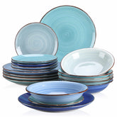
Begin with a reliable white or ivory set for clarity and sweetness cues. Keep a cool set—sea glass blues or leafy greens—for wind‑down meals after late legs. Add one warm accent—amber, coral, or a rosy rim—when you need appetite to wake up at off hours. Pair these with honest portion‑friendly sizes so the size illusion helps rather than hinders. When plating, maintain contrast and a clear focal point so your brain can say yes before your fork hits the runway.
If you are curious about how far presentation can go, professional sources such as The Culinary Pro and modern catering guides remind us to combine color with texture and height. A crisp garnish on a velvety puree with a luminous sauce dot is not restaurant preciousness; it is practical composition that helps you eat with attention when your day is a sprint. And if you ever wondered whether plate color truly matters, remember the consistent findings from Flavour Journal and chef’s training: color and shape tilt expectations, and expectations tilt experience.

FAQ
Do red plates really reduce how much I eat?
Reports gathered by culinary educators, including The Culinary Pro and other industry sources, note an appetite‑reducing effect associated with red plates. It is a nudge, not a guarantee. If portion control is your priority, combining a smaller plate with a red or dark hue stacks two helpful cues: the size illusion and the color effect.
Will a blue plate fix my circadian rhythm after a red‑eye?
No tableware color is a medical treatment for circadian disruption. Some commercial summaries citing research referenced by the National Institutes of Health suggest blue can feel calming and reduce arousal, which may suit a wind‑down meal after late arrivals. Treat color as a mood tool that supports better routines, not as a biological reset button.
Are matte finishes harder to maintain?
Matte hides micro‑scratches and fingerprints nicely, but it can show oil stains if left unwashed after richly colored sauces. Choose high‑quality matte glazes, wash with non‑abrasive sponges, and avoid thermal shock. If you want a lower‑maintenance middle ground, a satin finish delivers a soft sheen with easier cleanup.
Are metallic‑rimmed plates safe for the microwave?
Avoid microwaving pieces with metallic trims or gold accents. Manufacturers and sourcing guides consistently caution against it. For reheating, reach for plain ceramic without metallic decoration.
Sources Mentioned, Briefly
This guide draws on findings reported by Flavour Journal regarding color and plate shape, chef‑education resources from The Culinary Pro on color effects and pairing guidance, catering and plating principles summarized by modern presentation guides, commercial roundups referencing research associated with the National Institutes of Health for blue’s calming associations, as well as everyday dinnerware durability and care advice from reputable manufacturers and buyer’s guides.
Color is a joyful instrument—use it boldly and thoughtfully, even at 35,000 ft. Choose the plate that sets your pace, and let your meals keep delightful time with your day.
References
- https://mysacraft.com/index.php?route=blog/article&article_id=20
- https://www.theculinarypro.com/plate-presentations
- https://bullseyesalooncatering.com/color-contrast-and-composition-how-chefs-use-visual-design-in-catering/
- https://www.carawayhome.com/blog/ceramic-plates-ideas
- https://smart.dhgate.com/expert-tips-for-choosing-the-perfect-ceramic-dinner-plates-to-enhance-your-steak-dining-experience/
- https://ekaceramic.com/8-must-have-ceramic-dish-styles-for-modern-homes/
- https://www.getserveware.com/how-using-color-dinnerware-affect-food-presentation/
- https://www.happygodinnerware.com/Dinner_Plates/202412110920511274.html
- https://jqyceramics.com/why-restaurants-and-hotels-are-switching-to-color-glaze-tableware/
- https://137degrees.com/en/the-psychology-of-ceramics-and-food/


