Understanding Neutral Design Principles for Ceramic Cups in Professional Use
Neutral does not mean boring. In fact, in every office kitchen, hotel breakfast buffet, and co-working espresso corner I have ever styled, the quiet, neutral ceramic cup is usually doing the heaviest lifting. It carries coffee, brand identity, and mood, all without shouting for attention. When you design those cups intentionally, they become the backbone of a professional tabletop that feels calm, elevated, and effortlessly functional.
In this guide, I will unpack neutral design principles specifically for ceramic cups in professional settings, weaving together practical ergonomics, color psychology, material science, and the very real needs of busy offices, hospitality teams, and ecommerce brands. Think of it as a creative studio visit, but with a very pragmatic checklist in the other hand.
What Neutral Design Really Means for Ceramic Cups
Neutral design is often mistaken for “plain white and nothing else.” The reality, especially in contemporary tabletop design, is richer and more flavorful.
Color researchers and tableware brands note that professional tabletops now borrow heavily from fashion and interior trends. A report summarized by Vancasso, for example, describes “capsule neutrals” like crisp white, soft beige, cool gray, natural brown, and ivory as the base wardrobe for plates and cups. These tones photograph well, flatter a wide range of foods and beverages, and outlast micro-trends.
At the same time, color-led mug trends identified by Joyye show that neutrals today are not limited to sterile white. Earthy terracotta, deep greens, warm browns, soft grays, and muted blues form what they call an “earth tones renaissance.” These colors feel grounded and nature-connected, which works beautifully in offices aiming for calm focus or hospitality spaces that want cozy, slow-living vibes.
So in the context of ceramic cups, “neutral” is best understood as three things at once. It is visually quiet enough to support a range of beverages and environments, tonally flexible enough to play with different brand colors, and timeless enough to still look relevant when the next social-media trend has moved on.
Why Professionals Gravitate to Ceramic
Before we dive deeper into neutral aesthetics, it is worth asking why ceramic is the default in so many professional settings.
Ceramic is a broad family that includes earthenware, stoneware, and porcelain. Angie Homes describes a ceramic mug simply as a clay vessel fired at high temperatures, with each subtype having its own personality. Earthenware is lower-fired and more porous, stoneware is denser and rustic, and porcelain is the highest-fired, smooth, nonporous, and refined.
From a functional perspective, several sources converge on the same three superpowers: heat retention, taste neutrality, and comfort. Consumer Reports highlights that ceramic mugs hold heat better than standard glass and feel comfortable in the hand because the exterior does not get as scorching as metal. Coffee professionals quoted there recommend thick-walled ceramic cups for cappuccinos and lattes precisely because they keep the drink warm while offering a pleasant mouthfeel and a wide mouth for aroma.
Health-focused sources reinforce this preference. Healthier Homes, which evaluates mug materials for non-toxicity, performance, design, and eco-friendliness, places high-quality ceramic (especially porcelain and stoneware) among the safest options for daily coffee, provided glazes are free of toxic metals. Properly fired and glazed ceramic becomes nonporous and does not leach chemicals into hot drinks, unlike some plastics or poorly controlled coatings.
Curved office-mug specialists like CURVD describe their office-ready ceramic as durable, chip-resistant, and designed for strong heat retention, all while staying microwave- and dishwasher-safe. That combination matters when cups travel from desk to meeting room, into the microwave, then through a fast dishwasher cycle.
Here is how the main ceramic subtypes behave when you are designing neutral cups for professional use.
Ceramic Type |
Firing and Feel |
Strengths in Professional Use |
Considerations |
Earthenware |
Lower-fired, more porous, often thicker and visually cozy |
Warm, tactile look, often very colorful and approachable |
Less durable, more prone to chipping and staining; better for lighter-duty use |
Stoneware |
Higher-fired, dense, rustic, heavier walls |
Excellent heat retention, very durable, ideal for everyday office or cafe use |
Heavier in the hand; color options can be more muted and earthy |
Porcelain |
Highest-fired, thin yet strong, smooth and nonporous |
Elegant, refined, very stain-resistant, lightweight for servers to carry |
More expensive and can be more fragile if dropped; reads more formal |
In professional environments, stoneware and porcelain usually win. Stoneware suits busy office kitchens and cafes where durability and warmth matter more than delicacy. Porcelain suits hotels, fine-dining restaurants, and boardroom coffee service where a refined, almost weightless feel supports the brand story.
Neutral design choices should respect these material personalities. A matte stoneware mug in oatmeal or soft gray says “relaxed, grounded, team-friendly.” A thin-walled porcelain cappuccino cup in crisp white with a subtle ivory undertone will whisper “elegant, precise, hospitality-grade.”

Ceramic vs Other Materials: Staying Neutral Without Losing Performance
Professional buyers are not only comparing colors; they are also weighing ceramic against glass, stainless steel, enamel, and plastic. Neutral design has to stand up to these performance comparisons.
Guides from Joyye, Thinkitchen, Healthier Homes, and several custom-mug specialists describe the trade-offs clearly.
Glass has wonderful visual neutrality in the sense that it almost disappears, showcasing the drink itself. It is nonreactive and does not retain flavors, and special borosilicate versions handle temperature swings well. However, both Joyye and Ovalware note that standard glass mugs have relatively poor heat retention, feel fragile, and break easily. Consumer Reports adds that double-walled glass improves insulation but still cannot match a good ceramic mug for everyday ruggedness.
Stainless steel, especially double-walled travel tumblers, is a performance star. Joyye reports that insulated stainless steel can keep drinks hot for around four to six hours and cold for up to most of the day. Healthier Homes calls stainless steel one of the safest categories when well made, while also noting that metallic flavors and flavor carryover can be an issue. Steel is fantastic for travel and outdoor work, but its metallic shine rarely feels neutral on a quiet conference table.
Enamel is beloved for its nostalgic charm and durability. Joyye and Gelato both describe enamel mugs as lightweight, rust-resistant, and ideal for camping or outdoor events. Their visual language tends to be deliberately rustic and often colorful, which makes them less natural fits for refined neutral palettes. Enamel’s insulation is also modest, and chips, while charming in theory, are not ideal in a high-standards hospitality setting.
Plastic and melamine are praised for their shatter resistance and low cost, particularly for children, large events, or rough environments. However, Joyye and Thinkitchen both note concerns about chemical leaching at high temperatures, lower heat retention, and lower perceived quality. For professional environments that want a “quiet luxury” neutral aesthetic and a health-conscious story, plastic usually belongs in the kids’ zone, not in the boardroom.
When you line up these materials, ceramic remains the clear choice whenever you want a cup that quietly supports a wide range of professional contexts, from coworking spaces to boutique hotels. It is the material equivalent of a perfectly cut beige blazer: not the loudest piece in the room, but the one that makes everything else feel pulled together.

Neutral Color Palettes: Building the Professional Cup Wardrobe
Once the material is chosen, color is where neutral cups truly earn their keep.
Color-trend research from Vancasso and Joyye both highlight a shift away from cold, anonymous whites toward warmer, more characterful neutrals. Designers now talk about tones like butter yellow, mocha brown, martini olive, and blueberry milk, all part of the “foodification” of color naming. These colors tap into sensory memory and comfort food associations, which is exactly what you want when people reach for a morning mug.
In professional use, neutral ceramic cups benefit from a layered palette strategy that mirrors fashion.
First, establish a capsule of base glazes. Crisp white with a soft, slightly warm undertone remains the most versatile. It flatters coffee crema, tea, and herbal infusions, and it pairs with nearly any interior. Soft beige, warm stone, and pale gray expand the wardrobe without overwhelming it. Natural brown and matte black add depth and sophistication, especially in restaurants or design-led offices.
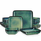
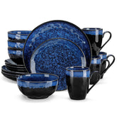
Second, use accent neutrals strategically. Deep forest green, midnight blue, or warm terracotta can still function as neutrals when applied carefully. For example, a stoneware mug in deep green with a natural clay base feels calm and nature-driven rather than loud and trendy. Vancasso points out that earth-based neutrals and matte finishes are central to the current “quiet luxury” movement, and that trend translates beautifully to ceramic cups.
Third, be cautious with dopamine brights. Joyye describes “vibrant pops of joy” such as cherry red, butter yellow, and rich ruby as color trends for 2025. On cups, a neutral design approach would use these as accents rather than all-over color. Think handle color, a thin rim line, or an interior glaze that peeks out when the mug is lifted. This keeps the cup collection broadly usable, while still creating moments of delight.
Most importantly, neutral palettes should support the drink itself. Consumer Reports notes that opaque ceramic helps visually “murky” brews, like French press coffee, feel more appealing than glass, where the sediment might look less appetizing. Conversely, herbal teas and layered lattes often look beautiful against clean white or softly tinted interiors. Neutral design for cups is about letting the beverage be the star, not the mug.
Form, Finish, and Texture: The Understated Drama
Neutral design is not only about color. The shape, finish, and surface texture of a ceramic cup can quietly transform the experience at a desk or dining table.
Shape plays two roles: visual calm and functional stability. Office-focused mug guides emphasize that a wide base improves stability and reduces spills on crowded desks. Malacasa’s desktop-organization article notes that vessels around three and a half to four inches high with a diameter between three and three and a half inches offer a low center of gravity that resists tipping, even in homes with pets or children. Those same proportions make for wonderfully stable cups on hotel breakfast buffets and coworking kitchen counters.
Lip and handle design influence both comfort and aesthetics. The office mug guide from DHgate and CURVD’s own ergonomic research highlight handles that comfortably fit one or two fingers, with smooth, rounded edges to prevent pressure points. A tapered lip can create a tighter, drip-resistant sip, while a slightly wider mouth enhances aroma and feels more generous. Neutral cups should feel effortless to hold and use; the shape should disappear into the background of the drinking experience.
Finish and texture are where neutral ceramics get subtly dramatic. Vancasso reports strong growth in demand for matte and satin glazes that recall handcrafted textures and “quiet luxury.” Matte stoneware in warm greige feels like cashmere for the hand. Satin finishes hide fingerprints and minor stains better than high gloss, which is useful in high-turnover office kitchens.
Glossy glazes still have a place, especially when a brand wants a sleek, modern look or needs maximum stain resistance in high-acid beverage service. Joyye notes that well-applied, non-toxic glazes make ceramic interiors highly resistant to staining and odors, which is essential for professional environments where cups are used all day. The neutral design trick is to pair glossy finishes with restrained silhouettes and colors, so the shine reads as sophisticated rather than flashy.
Subtle surface details like speckles, ombré washes, or slightly exposed clay bases can keep neutral cups from looking flat. The Strategist’s profile of designer work mugs highlights intentional speckling, drips, and unusual handles as micro-moments of joy that still feel professional. In a neutral palette, those details become texture rather than noise.

Neutral Design in Different Professional Contexts
Neutral ceramic cups need to perform differently in a tech office, a boutique hotel, and a growing ecommerce brand. The underlying principles stay consistent, but the emphasis shifts.
In offices, comfort and practicality sit at the center. The CURVD office-mug articles define an ideal workspace mug as ergonomic, durable, and easy to clean, with a capacity in the range of roughly ten to seventeen fluid ounces. That range (converted from the commonly cited 300 to 500 milliliters) gives enough volume for a generous coffee without forcing constant refills. Neutral colors like black, white, deep blue, or soft green coordinate with most office interiors, while still allowing pops like a Green Meadow glaze for teams that want a little more playfulness.
Offices increasingly treat mugs as multiuse tools. New York–based designers profiled by the Strategist admit they use ceramic cups as planters and pen holders as often as for coffee, and Malacasa makes a persuasive case for using a single ceramic cup as a desktop “micro-trash” bin for wrappers and tags. Neutral designs are crucial here; a simple matte sand or charcoal cup can move seamlessly from cappuccino to pencils to plant pot without visually cluttering the desk.
In hospitality, neutral cups need to support brand storytelling and durability at scale. Hospitality sources cited by Accio emphasize that drinkware is a key part of the guest experience and must align with the overall brand. Earthy stoneware cappuccino cups in warm brown or deep green will feel right at home in a farm-to-table cafe, while thin, bright-white porcelain espresso cups suit a modern urban hotel bar.
Because hotels and restaurants purchase in volume, designers also keep an eye on long-term trends and market growth. Joyye notes that the global ceramic tableware market, which includes mugs and cups, is projected to reach more than one hundred billion dollars by 2034, driven by consumers who care about both aesthetics and function. For these buyers, neutral cups are not an afterthought; they are core assets that must stay relevant over many seasons.
In ecommerce and print-on-demand, neutral ceramic cups act as blank canvases that need to sell across thousands of screens. Gempages and Gelato describe custom cups as low-barrier, high-impact branded products, with the custom-printed mug industry itself expected to reach billions of dollars in value. Their advice is to choose materials like ceramic or porcelain for everyday personalized mugs, then use neutral bases with selective graphics to appeal to broad audiences.
Design platforms like GemPages and Printful highlight that eco-conscious, reusable drinkware is an expanding part of the drinkware market, with eco-friendly products projected to take a significant share of future sales. Neutrally designed ceramic cups slot perfectly into that narrative: reusable, non-plastic, durable, and easy to align with sustainable color stories like earth tones and “sustainable hues.”

Core Neutral Design Principles for Professional Ceramic Cups
Bringing all these threads together, several neutral design principles emerge for professional ceramic cups. These are the choices I return to when I am curating cup collections for offices, hospitality, and brands.
The first principle is to start with a versatile base glaze. White, soft beige, warm gray, and natural clay tones work across seasons, beverages, and interior styles. They flatter the color of coffee, tea, and even water, while allowing food and logos to stand out without competition. Vancasso’s guidance on capsule neutrals for tableware translates directly to cups: let the base do the quiet work so accents can shine in small doses.
The second principle is to design for comfort before decoration. Office mug research emphasizes balanced weight, comfortable handles, and smooth rims. CURVD’s ergonomic designs are built around wide, sturdy handles that reduce strain, even for people with reduced grip strength. A neutral cup that is unpleasant to hold will always be the last one chosen in the cupboard, no matter how beautifully it matches the carpet.
The third principle is to choose finishes and textures that support the context. Matte or satin glazes feel handcrafted and hide minor wear, perfect for creative studios, casual cafes, and relaxed offices. High-gloss glazes shine under hotel lighting and wipe absolutely clean, ideal for high-visibility hospitality environments. The “quiet luxury” trend that Vancasso tracks shows that many professionals prefer a soft, tactile finish that reads as refined rather than shiny.
The fourth principle is to integrate brand or mood color as accents, not full coverage. Joyye’s “vibrant pops of joy” and dopamine decor ideas can absolutely live on neutral cups, but usually through a colored interior, a stripe around the base, or a distinctive handle. Templi’s branding guide encourages brands to align cup design with interiors and menus, and a neutral-first palette with intentional pops is a simple way to do that without repainting your identity every year.
The fifth principle is to design for multiuse and sustainability. Malacasa and DHgate both describe repurposing ceramic cups as organizers, miniature planters, or desk ornaments, and sustainability-minded guides praise reusing mugs instead of buying new decor. A neutral cup with a stable base, nonporous glaze, and timeless color can shift from coffee cup to pen holder to desktop trash cup as roles change, extending its life and reducing waste.

Choosing Neutral Ceramic Cups: Practical Considerations
When you are ready to specify or buy neutral ceramic cups for professional use, it helps to walk through a few practical lenses rather than just chasing a pretty mood board.
Capacity and proportion come first. For office settings, several sources converge around ten to fourteen fluid ounces as a sweet spot. CURVD, for example, offers around fifteen- and twenty-ounce sizes for workplaces, capturing both quick drinkers and slow sippers. Angie Homes notes that standard everyday mugs are usually eight to twelve ounces, with larger fourteen- to sixteen-ounce mugs serving specialty drinks or people who want fewer refills. In hospitality, a more segmented approach makes sense: smaller cups for espresso and cappuccino, mid-sized for filter coffee and tea, and larger mugs for breakfast service or guests who linger.
Next is ergonomics. The office mug guide from DHgate and CURVD’s own research both emphasize wide, comfortably rounded handles that accommodate one or two fingers without pinching, and a weight that feels substantial but not wrist-tiring. Beware of mugs that look sculptural but have tiny, angular handles or extremely thick walls; they may photograph beautifully but become daily annoyances. Neutral design is about everyday ease.
Durability is the quiet hero in professional use. Stoneware and high-quality porcelain both offer strong chip resistance when properly fired. CURVD explicitly designs their office mugs to withstand frequent trips between desks, meeting rooms, and dishwashers without cracking or losing their finish. Joyye names ceramic as a go-to for food-service venues because it balances excellent heat retention with microwave and dishwasher safety, as long as you avoid sudden temperature shocks.
Safety and glaze quality should never be an afterthought. Healthier Homes and Angie Homes both warn that vintage or decorative ceramics made with old glazing systems can contain lead or cadmium that may leach into hot drinks, especially acidic ones. For professional use, it is safest to choose modern, food-safe ceramic from reputable manufacturers and to repurpose any suspect antiques purely as decor or storage. Porcelain fired at very high temperatures around 2,400°F becomes inherently nonporous, which further reduces risk when glazes are properly formulated.
Finally, think about maintenance. Office and hospitality managers appreciate mugs that resist staining from coffee and tea and that do not require delicate handling. Joyye notes that glazed ceramic interiors are odor-neutral and easy to wipe clean, and CURVD emphasizes dishwasher safety and stain resistance as core benefits. At the same time, barista practice shared in office mug guides suggests rinsing cups soon after use and treating stubborn stains with gentle abrasives like baking soda paste to extend glaze life. For delicate matte finishes, occasional handwashing instead of daily dishwashing can help preserve that velvety look.

A Short FAQ on Neutral Ceramic Cups in Professional Use
Are neutral ceramic cups boring for brand storytelling?
They do not have to be. Branding guides from Templi and Gempages position mugs as powerful storytelling tools, and they often recommend neutral bases with focused graphics or color pops. A quiet stoneware mug in warm greige with a deeply saturated logo or a thin colored rim can feel more premium and timeless than a fully printed, high-contrast design that dates quickly. In other words, think of neutral ceramic cups as the stage, not the entire show.
Which ceramic type is best if we want neutral cups that last in a busy office?
For most offices and co-working spaces, high-fired stoneware in matte or satin neutrals is a sweet spot. Angie Homes and Joyye both describe stoneware as dense, chip-resistant, and strongly heat-retentive, with a rustic, grounded look that feels cozy but professional. Porcelain is wonderful for lighter, formal service but may feel a bit delicate for communal kitchens and frequent desk-to-dishwasher journeys.
How can we keep neutral cups looking fresh over time?
The most effective approach is a mix of design and habits. Choose glazes that are stain-resistant and slightly forgiving, such as satin or soft matte in mid-tone colors rather than bright white only. Encourage quick rinsing after use, especially with tea and dark coffee, and rely on gentle cleaning methods like baking soda paste for occasional deep cleaning. Malacasa’s guidance on using ceramic cups as micro-trash bins also offers a surprising bonus: repurposing older or slightly worn cups as organizers or planters extends their life and keeps the newer drinkware looking pristine in the cupboard.
A neutral ceramic cup is a small thing, but strung across desks, boardrooms, buffets, and online product grids, it becomes part of the architecture of daily life. When you combine the quiet confidence of stoneware or porcelain, a thoughtful neutral palette, and shapes that invite the hand without shouting for attention, you get cups that people reach for again and again. That is the sweet spot where aesthetics, practicality, and joy hold hands on the tabletop, and it is where neutral design for ceramic cups truly shines in professional use.
References
- https://www.consumerreports.org/health/coffee/best-types-of-coffee-mugs-to-keep-coffee-warm-a7384089445/
- https://gempages.net/blogs/shopify/cup-design-ideas
- https://www.accio.com/business/trending-cups
- https://theartisanemporium.co.in/mastering-ceramic-colors-a-practical-guide-to-choosing-your-palette/?srsltid=AfmBOopqG4CZ0ylUhm__MrePG4Wt18WvAjWWhDrnaUNTFN-CIBgAXrEe
- https://cupbottles.com/recommended-creative-ceramic-mugs-suitable-for-office-use-enhance-your-workspace/
- https://smart.dhgate.com/creative-ideas-for-using-a-ceramic-coffee-cup-as-a-stylish-and-functional-desk-ornament/
- https://ekaceramic.com/2025-color-trends-for-ceramic-coffee-mugs/
- https://www.gelato.com/blog/cup-design-ideas
- https://www.healthierhomes.com/post/safest-material-for-coffee-mugs?srsltid=AfmBOorBJ7avCk6d_akMAtIls68w54RxHS-EghWiYpHCZfmH3Zch531Z
- https://joyye.com/info-detail/mug-materials-ultimate-guide


