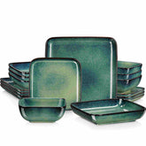
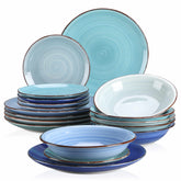
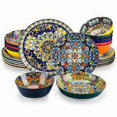
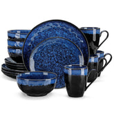
Rethinking Binary Gender Norms in Ceramic Tableware Design
When you set a table with soft pink florals “for the girls” and deep navy stoneware “for the guys,” it can feel charming, even thoughtful. Yet underneath those well‑intentioned choices sits a design story shaped by centuries of gender rules about who eats what, how much, and from which bowl. As more of us live outside those tidy pink‑and‑blue boxes, our ceramics have some catching up to do.
As a Colorful Tabletop Creative & Pragmatic Joy Curator, I care about how plates make people feel in their bodies and in their identities, not only how they look on a feed. The good news: research from ceramic design, queer art, Feng Shui, and consumer behavior gives us concrete ways to move tableware beyond binary gender norms without losing beauty, ritual, or practicality.
This article unpacks where gendered ceramics come from, why they feel increasingly out of step, and how designers, brands, and home hosts can reimagine tableware so every guest at the table feels seen, safe, and stylish.
How Our Plates Got Gendered
Binary gender norms in tableware are the habits and design decisions that code certain shapes, sizes, colors, and motifs as “for men” or “for women,” usually assuming only two genders and traditional roles. They show up in everything from the size of a rice bowl to the palette of a baby shower.
Japan’s Meoto Bowls: A Case Study in Gendered Ceramics
Writing on tableware traditions in Japan from sources like Tsukushi Japan and Little Things in Japan describes a clear historical example. During the Edo period, when ceramic techniques matured and utensils were carefully proportioned to the human body and social position, tableware explicitly reflected gender and role. Robust wares were made for samurai men with larger physiques and presumed stronger appetites, while more delicate pieces were associated with courtly women.
One of the most recognizable outcomes is the “meoto jawan,” husband‑and‑wife rice bowl sets pairing a visibly larger bowl with a smaller companion. The size difference is not subtle; men’s bowls were often more than one‑third larger. Chopsticks followed similar rules, around 9.1 inches for men and about 8.3 inches for women, based on hand size and expected appetite.
Color and motif also split along gendered lines. Men’s bowls and cups traditionally leaned on muted blues, greens, indigo, black, and gray with restrained nature patterns that signal calm and dignity. Women’s pieces favored bright or pastel reds, pinks, whites, and creams with floral or bouquet designs that read as gentle and decorative. Even ceremonial lacquerware for a baby’s one‑hundred‑day “first meal” used different colors and motifs for boys and girls.
These traditions are not static. Contemporary writing from Tsukushi Japan notes that strict rules are softening, and current recommendations increasingly emphasize comfort, fit, capacity, and lifestyle over gender coding. Yet meoto sets and gendered lacquerware remain popular in traditional contexts and gift culture, quietly reinforcing the idea that tableware should mirror a binary couple.
The Pink‑and‑Blue Party Machine
On the other side of the world, party culture has pushed gender coding in the opposite direction: less about functional differences and more about thematic spectacle. Retailers and planning guides describe gender reveal and baby‑shower tableware that leans hard into pink‑for‑girls, blue‑for‑boys tropes, from plates and napkins to streamers and cake toppers.
However, guides from event companies and decor brands show a clear shift. Gender‑neutral baby showers are described as celebrations that avoid revealing a baby’s sex and instead use inclusive, non‑gendered themes and color palettes. Planners recommend woodland and safari motifs, celestial skies, storybook worlds, minimalist geometric shapes, rainbows, and eco‑nature concepts. Color schemes pivot to earth tones like greens, browns, and beiges, soft pastels like mint, lavender, and peach, muted dusty blues and yellows, and monochrome neutrals of gray, cream, and white.
Retailers of party supplies now maintain entire gender‑neutral categories and even filter for top‑rated gender‑neutral items, indicating real demand. At the same time, marketplaces for gender reveal tableware still flourish, and equality‑branded plates with rainbow motifs appear on general e‑commerce platforms with little explanation beyond their names. Together, these signals show a transitional moment: the old binary language still sells, but a robust market is emerging for tableware that does not force identity into pink or blue.
Why Binary Tableware Norms No Longer Fit
Our ceramics do not live in a vacuum. They sit in the middle of changing conversations about gender, sustainability, mental health, and consumer ethics. Several strands of research around contemporary ceramics and consumer preferences help explain why binary design feels increasingly misaligned.
Identity, Queerness, and Ceramics as Story
The LSU Museum of Art’s exhibition “The Shaping of Us: Queerness in Ceramics” frames clay as a powerful medium for exploring personal and sexual identity, social pressure, and LGBTQ+ experiences. Artists like Joseph Kraft and Heather Mae Erickson use ceramic installations as intimate narrative spaces, turning tableware and sculptural forms into autobiographical and community storytelling devices. Erickson’s “Pride Pots: Community Conversations” project explicitly uses ceramic‑making and guided dialogue to host challenging conversations about LGBTQ+ issues, demonstrating how cups and bowls can become tools for dialogue rather than props for gender roles.
Another vivid example comes from Rococo‑inspired ceramist Jen Dwyer. Her work, profiled by art platforms, uses pastel pinks, baby blues, and frilly Rococo motifs often dismissed as “too feminine,” then injects subversive details like long fingernails and chains. She draws on feminist writing to reframe fairytale archetypes and actively responds to the macho legacy of twentieth‑century California clay, questioning why pastel colors and delicate forms are often taken less seriously. Dwyer intentionally builds environments that feel safe for introverted and sensitive people, offering quiet empowerment instead of bravado.
Both the museum show and Dwyer’s practice show ceramics being used to question, rather than reinforce, traditional gender expectations. When plates and mugs carry queer and feminist narratives, rigid binary styling starts to look dated.
Emotional Durability and Personal Attachment
Research in the International Journal of Design on emotionally durable ceramic tableware focuses on how to design pieces that people will love, keep, and use over the long term. Through interviews and user studies, the work highlights three levels of experience: immediate visual and tactile reactions, behavioral aspects like comfort and handle fit, and reflective layers like memory and identity.
Participants in that study overwhelmingly gravitated toward mugs, not formal cups and saucers, and they valued subtle irregularities, traces of making, and small surprises in glazing. Designers are encouraged to offer sets where each mug or piece is slightly different so users can adopt a favorite and develop a personal bond. These recommendations lean toward variety within a collection rather than strict matching.
Binary gender norms push tableware toward predictable categories: all the “feminine” set in florals here, all the “masculine” matte black there. Emotional durability research suggests almost the opposite: longevity and love come from pieces that feel uniquely “mine,” that hold memories, and that allow users to see their complex identities reflected back. That can mean soft pink for a burly man, deep charcoal for a nonbinary teen, or a mix of motifs across one shared family shelf.
New Generations, New Values
Market and consumer reports on ceramic dinnerware, such as those summarized by Joyye, show that the global ceramic dinnerware market is growing strongly, with projections from around $12.4 billion to over $22 billion in about a decade, at an estimated growth rate of roughly seven percent each year. North America holds a large share, and consumers are moving away from rigid, perfectly matched sets toward eclectic, mix‑and‑match collections featuring artisanal textures, reactive glazes, and irregular forms.
At the same time, writing from Restaurantware on Gen Z tableware habits describes how younger consumers treat tableware as self‑branding. Every brunch, picnic, and weeknight dinner is a potential photo moment, and Gen Z favors inclusive, gender‑neutral aesthetics: earthy tones, geometric patterns, soft curves, and culturally diverse motifs that do not scream “for him” or “for her.” They value sustainability, ethical production, and long‑lasting pieces and gravitate toward brands and artisans that share those values.
Academic work on young Chinese consumers, summarized in research briefs, points to similar design priorities using hedonic and utilitarian value theory. Functional performance, aesthetics, and symbolic meaning all shape purchasing decisions, and methods such as Kansei engineering translate emotional impressions into tangible design attributes. When symbolism and aesthetics are key, gender‑coded visuals risk feeling exclusionary instead of aspirational.
Taken together, these perspectives show that younger consumers want ceramics that are emotionally engaging, ethically made, and expressive of personality, not of gender scripts written long before they were born.

Redesigning Ceramic Tableware Beyond the Gender Binary
Moving beyond binary does not mean stripping the table of romance, sentiment, or tradition. It means widening the vocabulary of form and color so more people can sit down and feel, “This place setting was chosen with me in mind.” Design research, cultural traditions, and even Feng Shui offer a surprisingly practical toolkit for that shift.
Rethinking Form, Size, and Ergonomics
Historical Japanese practice used bowl size and chopstick length to mirror gender, appetite, and hierarchy. Contemporary guidance from Tsukushi Japan, however, now urges choosing tableware primarily based on hand fit, weight, grip, and capacity, regardless of gender. That pivot from gender category to embodied comfort is a perfect blueprint for a gender‑expansive approach.
Modern dinnerware design, as discussed by Euro Ceramica, already treats plate silhouettes, rims, and weight distribution as serious ergonomic questions. Coupe plates with soft, rimless edges provide generous plating space and a modern look, while inverted rims can give extra grip and spill control. Designers deliberately balance portion realism, visual harmony, and weight so serveware is light enough to pass and main plates feel stable. None of this inherently demands gender coding.
A gender‑expansive approach can keep the ergonomic rigor and drop the labels. Instead of “men’s” and “women’s” sizes, imagine sets designed for small, medium, and large appetites, or for different grip strengths. Labels could emphasize use and feel, such as “lightweight comfort bowl,” “extra‑capacity noodle bowl,” or “wide‑lipped curry plate,” letting any person choose what supports their hunger and body that day.
There are pros to honoring traditional sizing in certain rituals. Meoto jawan sets, for example, carry cultural symbolism of partnership and harmony and remain meaningful gifts. The risk is when those symbolic sizes are read as mandates rather than options, making a woman with a large appetite feel self‑conscious, or rendering a man with a smaller appetite invisible. Reframing these sets as “paired bowls celebrating difference” instead of “his and hers” can keep the poetry and shed the prescription.
Color, Pattern, and Symbolism Without Stereotypes
Color may be the loudest way tableware talks about gender, yet research on tableware colors through a Feng Shui lens suggests a much richer, non‑gendered story. Malacasa’s guide to ceramic tableware colors explains that ceramics belong to the Earth element, associated with stability and nourishment. Earth colors such as beige, sand, warm taupe, terracotta, and soft yellow are linked to comfort and groundedness. The Feng Shui Five Elements framework further ties greens and browns to growth and family energy, fiery reds and oranges to passion and joy, whites and metallics to clarity and refinement, and blues and blacks to calm, depth, and career energy.
Notice what is missing: there is no decree that pink belongs only to women or cobalt to men. Instead, colors are associated with moods and intentions. Expert advice in that Feng Shui perspective recommends starting with intention—do you want calm, lively conversation, prosperity symbolism, or minimalist clarity—then choosing colors you genuinely like that support that atmosphere. Fire tones are even suggested as accents, such as crimson plates or terracotta bowls, to stimulate appetite and joy without overpowering the space.
This intention‑led approach is deeply compatible with gender‑expansive design. Rather than assigning pastel tableware to “ladies’ luncheons” and dark matte stoneware to “bachelor dinners,” hosts and designers can ask what emotional temperature they want: playful brunch, grounded family supper, quiet solo lunch, or celebratory party. Palettes built around earth and wood tones for everyday calm, or bright accents for festive gatherings, can be offered without gender labels.
Ceramic design guidance from sources like Ceramic Arts Network and custom printing studios reinforces the importance of unifying form and surface. Successful plates and bowls apply design principles—balance, emphasis, pattern, rhythm, unity—at every stage, from shaping to glazing. Whether the motif is floral, geometric, narrative, or abstract, the key is coherence and depth, not gender. Artisans are encouraged to create collections that harmonize across pieces while leaving room for individual expression; modular mix‑and‑match lines from brands like Euro Ceramica illustrate how different patterns and finishes can still tell one visual story. That modularity is a natural ally for gender‑inclusive styling.
Tableware as Emotional and Cultural Story
When ceramics carry stories, they move from being gender signals to being identity mirrors. The queer‑focused exhibition at LSU and Jen Dwyer’s Rococo‑feminist work make this clear: plates and cups can narrate resilience, critique, sensuality, and humor.
Emotional durability research suggests that small narrative cues and irregularities invite users into longer relationships with objects. A cup that shows the trace of a thumb in its handle, a plate with a slightly asymmetrical rim, or a glaze where hand painting is still visible can all become starting points for stories: who gave this to me, what chapter of my life it represents, how it makes me feel. When those stories are encouraged across diverse genders and orientations, tableware becomes a stage for multiplicity rather than a sorting mechanism.
Brand and designer choices matter here. For instance, a decorative plate with rainbow equality motifs implicitly invites queer and allied diners to see themselves at the table. Community initiatives like Pride‑centered ceramic workshops show that when people literally shape their own cups, they shape new narratives about belonging. Each of these moves shifts ceramics from enforcing gender norms to expanding who gets to feel at home at the table.

A Practical Framework for Gender‑Expansive Tableware
Big ideas are beautiful, but the real magic happens when you open a cupboard or plan a collection. Here is how different people in the tableware ecosystem can translate this research into tangible, colorful change.
For Home Cooks and Hosts
Start by simply noticing what your current tableware says. If every “special” plate is floral and every everyday mug is oversized and dark, that might be a clue that you have subconsciously gendered your collection. You do not have to discard beloved pieces; instead, loosen the pairing between guest identity and object. Serve a man dessert in the delicate rose‑rimmed dish. Offer a nonbinary friend the brightest, most luminous plate at the table. Let people choose what delights them rather than assigning based on your assumptions.
When you add new pieces, lean into the mix‑and‑match trend documented in dinnerware market analysis. Look for stoneware and porcelain lines that are designed to be modular: maybe a soft oatmeal base with accent salad plates in teal, sand, and rust. Borrow from gender‑neutral baby‑shower palettes by incorporating earthy greens, muted yellows, and grays that flatter all kinds of food and all kinds of people. Rustic charm, minimalist elegance, pastel playfulness, and bright eclecticism can all coexist on one shelf when tied together by shared material or silhouette.
Consider the emotional energy of your table the way Feng Shui practitioners do. For calm weeknight meals, keep your base set in grounded earth and wood tones. For lively gatherings, fold in a few fire‑colored serving pieces—a brick‑red platter or amber glaze bowl—to wake up conversation without assigning them to a gendered “side” of the table. If prosperity symbolism or gratitude rituals matter to your household, an earth‑toned fruit bowl filled with nine lemons or oranges can say abundance without saying “boy or girl.”
Do not forget that ceramic dinnerware can travel beyond the dining table. HF Coors, for example, emphasizes how bowls, cups, and plates can become wall art, jewelry catch‑alls, bathroom organizers, planters, desk accessories, candle holders, and more, thanks to vitrified, durable, non‑porous bodies. When your favorite “girly” teacup becomes a succulent planter in a shared living room, or your “masculine” espresso cup turns into a pen holder on a communal desk, those gender labels start to dissolve into pure aesthetic pleasure.
Finally, remember inclusivity is broader than gender. Research on augmented‑reality guidance for low‑vision cooks shows that simple color‑coded overlays on plates and tools can dramatically improve confidence and safety, especially when highlights clearly distinguish safe grip zones from hazardous edges. Even without high‑tech AR, you can borrow the principle: choose high‑contrast plates that make food easy to see, avoid patterns that visually break up the rim for guests with depth‑perception challenges, and speak aloud about where hot surfaces are. A table that is hospitable to disabled guests is more genuinely inclusive for everyone.
For Ceramic Designers and Brands
Designers and manufacturers sit at a particularly powerful intersection of culture, commerce, and clay. Research on young consumers and product design emphasizes that people evaluate tableware across functional, aesthetic, and symbolic dimensions, and that hedonic pleasure and utilitarian benefits both matter.
Functionally, inclusive design begins with ergonomics and safety, not with gender categories. Guidelines highlighted in dinnerware standards discussions show how critical it is to prioritize non‑toxic materials and compliance with regulations that strictly limit lead and cadmium migration. Frameworks such as the US Food and Drug Administration rules and Germany’s LFGB system encourage “compliance by design,” where glaze composition, decoration placement, and firing processes are planned for safety from the start. Gender‑neutral collections should be at least as safe and durable as traditional ones, not positioned as a trendy afterthought.
Aesthetically, variety and modularity are your allies. Joyye’s analysis of consumer preferences underscores that people now enjoy building eclectic collections and want open stock pieces they can mix. Offer collections where shapes are united by line and proportion, but surfaces diverge: maybe one mug has a botanical drawing, another a geometric grid, a third a speckled field. Keep color stories flexible, with palettes that blend earth tones, blues, and accent brights. Make sure no single pattern screams a specific gender; instead, think in moods like grounded, vibrant, contemplative, or celebratory.
Symbolically, be deliberate with language and marketing. Replace phrases like “his and hers” with “paired set,” “companion bowls,” or “contrast duo.” When referencing traditions like meoto sets, provide gentle context and offer alternate pairings where both bowls are the same size but decorated differently. Showcase queer and nonbinary makers in your storytelling, much like institutions that partner with LGBTQ+ communities for ceramics exhibitions.
From a service and packaging perspective, research on reusable tableware packaging and environmental messaging shows that eco‑conscious, reusable solutions paired with clear environmental communication can shift behavior in online retail. Younger consumers in particular respond well to sustainability narratives and ethical transparency. Inclusive design and sustainability often appeal to the same audience; lean into that overlap by emphasizing durability, repairability, and long‑term emotional value.
For Event Planners and Retail Buyers
If you design events or curate retail assortments, you can make gender‑expansive tableware the default rather than the niche. Party planning guides that center gender‑neutral baby showers already recommend themes like woodland, eco‑nature, minimalist geometry, storybook, and celestial skies, and color palettes ranging from dusty blue and soft yellow to rich earth tones and metallic accents.
When you build tablescapes, focus on theme and mood before gender. A “forest brunch” might combine natural linen, dark‑green stoneware, wood chargers, and plant‑based centerpieces. A “celestial supper” could pair deep navy linens with white or gray dinnerware and metallic cutlery, using starry motifs in subtle runs rather than splitting the room into pink and blue sides. A rainbow palette can read as inclusive and joyful when used across the entire space instead of in two opposing camps.
From a sourcing standpoint, take advantage of retailer filters that mark products as gender‑neutral and prioritize those with strong customer ratings. That way you are not only aligning with inclusive values but also with demonstrated quality. Stock lines that customers can mix—stackable stoneware in neutrals, accent plates in trending colors, and versatile glassware that feels comfortable in any hand. For clients who desire traditional gender reveal moments, gently offer alternatives such as surprise‑filled desserts or lighting effects rather than permanently gendered plates that will be hard to reuse.
Comparing Binary and Gender‑Expansive Tableware
A concise way to clarify the shift is to look at how binary norms and gender‑expansive thinking tackle the same design questions.
Dimension |
Binary Gendered Tableware |
Gender‑Expansive Tableware |
Sizing and ergonomics |
Separate “his” and “hers” bowls, cups, and chopsticks based on gender |
Range of sizes and weights labeled by use and comfort, open to any body and appetite |
Color and motif |
Pink, florals, and pastels for women; darker blues and neutrals for men |
Colors chosen for mood, intention, and food framing; motifs reflect stories and cultures |
Symbolism |
Emphasis on traditional roles and heteronormative couples |
Emphasis on diverse identities, relationships, and narratives, including queer experiences |
Emotional connection |
Attachment tied to gendered gifting and roles |
Attachment tied to personal meaning, memory, and aesthetic resonance across identities |
Market messaging |
“His and hers,” “ladies’ set,” “man cave” mugs |
“Couple’s set,” “mix‑and‑match,” “signature mug,” with inclusive model imagery |
Neither column is inherently devoid of meaning. The question is which one better reflects the way people actually live and identify today.

Short FAQ: Inclusive Tableware in Everyday Life
Does moving away from binary tableware mean abandoning tradition?
Not necessarily. Traditions like meoto jawan or ceremonial lacquerware can be reframed rather than erased. You might keep a paired bowl set as a symbol of partnership but stop assuming which partner uses which piece. The key is offering choice and context instead of fixed assignments.
Is gender‑neutral tableware always minimalist and beige?
It does not have to be. While neutral palettes are versatile and popular, research on color and mood in ceramics shows that vibrant blues, greens, yellows, and even rich reds can all be used in inclusive ways. What makes a design gender‑neutral is the absence of stereotypes, not the absence of color.
How can small studios with limited budgets design more inclusively?
Start with language and modularity. Rename “his and hers” items, photograph diverse hands using your pieces, and design collections where shapes match but surfaces vary so customers can curate their own combinations. Inclusive storytelling and thoughtful naming cost little but change how your work is perceived and who feels invited to buy it.

A Colorful Closing
When we strip away the old rulebook that says which bowl belongs to whom, we do not lose beauty or meaning. We gain a table where a pastel‑obsessed dad, a nonbinary teen, a quiet queer elder, and a hyper‑minimalist aunt can all reach for the pieces that make their hearts light up. Rethinking binary gender norms in ceramic tableware design is not about making everything beige; it is about designing and styling with enough curiosity, empathy, and playful rigor that every seat at the table feels deliberately, joyfully set.

References
- https://academicworks.cuny.edu/cgi/viewcontent.cgi?article=1014&context=sps_pubs
- https://www.lsumoa.org/theshapingofus
- https://ceramicartsnetwork.org/daily/article/Ceramic-Surface-Design-Techniques-on-a-Plate
- https://www.ijdesign.org/index.php/IJDesign/article/view/571/263
- https://www.researchgate.net/publication/382632351_Research_on_the_Application_of_Ceramic_Tableware_Design_for_Young_Chinese_Consumers
- https://www.amazon.com/gender-neutral-plates-napkins-decorations/s?k=gender+neutral+plates+and+napkins+decorations
- https://www.ceramicprinting.com/tips-for-designing-custom-dinnerware-sets/
- https://www.etsy.com/market/gender_reveal_tableware
- https://www.joyye.com/info-detail/consumer-preferences-in-ceramic-dinnerware-styles
- https://picopartyrents.com/gender-neutral-baby-shower-decor/


