Choosing Ceramic Colors for Night Shift Workers Amid Blue Light Effects
Night work rewrites the script for everything from hunger to home routines. Under bright, cool warehouse LEDs at 1:00 AM or the humming blue glow of a nurse’s station, appetites fluctuate and energy crests and dips at odd hours. Here’s the surprising good news: the colors on your table—plates, bowls, and even glazes—can nudge how energized you feel, how calm you land before sleep, and how much you eat. As a Colorful Tabletop Creative & Pragmatic Joy Curator, I’ve spent late nights staging meals for night‑shift teams and testing palettes under real lighting, and I’ve seen small color decisions make an outsized difference. This guide blends color psychology, lighting science, and hands-on tableware know‑how so you can plate smarter for your schedule without losing the joy and artistry of a beautiful table.
The Blue-Light Backdrop of Night Work
Light is the master time cue for the body’s internal clock. In circadian science it’s called a zeitgeber, a rhythm setter that keeps the brain in sync with the 24‑hour day. Specialized retinal cells known as ipRGCs respond strongly to short‑wavelength, blue‑rich light and signal the brain’s suprachiasmatic nucleus, which in turn shapes melatonin patterns, alertness, and mood. A randomized cross‑over study in Copenhagen among healthy older adults tested blue‑enriched versus blue‑suppressed morning lighting and found no large objective sleep changes overall, but women reported better sleep quality with the blue‑enriched morning light. The practical message, echoed by sleep education from the Sleep Foundation and interior design experts, is consistent: use brighter, cooler light when you want to be alert, and shift to warmer, lower light as you approach sleep. For night shifters, that means deliberately managing the color temperature of your environment when you transition home, and choosing tableware colors that reinforce the mood you need in that moment.

Color On the Table Changes Appetite, Pace, and Perception
Color doesn’t just decorate your meal; it can shape how it looks, how much you want to eat, and how satisfied you feel. Consumer guidance from MALACASA and tableware color psychology rundowns point to two big levers you control: the hue itself and the contrast between food and plate. Warm colors such as red, yellow, and orange often feel energetic and can stimulate appetite. Cool hues—especially blue and green—tend to calm and, for many people, can subtly suppress appetite and slow the pace of eating. Contrast matters too. High contrast makes food pop and can make portions look bigger, while low contrast blends edges and can make portions look smaller. As a practical example, a mound of mashed potatoes appears more substantial on a dark plate than on a white one, and a red sauce may feel larger and more vivid against a plate that doesn’t match it. These are perception shifts, not hard rules, and individuals vary. The best strategy is to start with known tendencies and then tune to your own reactions.
Mindful eating benefits from calming tones. Soft blues, gentle greens, and earthy neutrals encourage a slower pace and more attention to texture and aroma. A Travelodge survey on bedroom colors once reported that people in blue rooms slept longer than those in purple ones, a reminder that cool, muted palettes support rest. While that study looked at walls, not plates, the same visual principle—lower arousal with cool, desaturated color—translates nicely to the dinner table when winding down after a shift.

A Night-Shift Palette Plan: When to Warm It Up, When to Cool It Down
Night work means your “dinner,” “midnight snack,” and “breakfast” arrive at unusual hours. Use color to match the physiological moment, not the clock on the wall. Before a shift, a touch of warmth helps you rally. Mid‑shift, steadying cools can keep cravings from stampeding. At end‑of‑shift, soothing hues ease the slide toward sleep.
Night‑shift moment |
Plate color palette |
Finish and texture |
Portion‑perception cue |
Example use |
|
Pre‑shift fuel (around 6:30 PM) |
Gentle alertness |
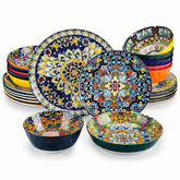
Warm accents like coral, apricot, or saffron layered over a neutral base |
Semi‑matte or glossy for a little sparkle |
Moderate contrast to keep food appealing without oversizing |
Grain bowls, lean proteins, roasted veg |
Mid‑shift meal (around 1:00 AM) |
Focused, steady |
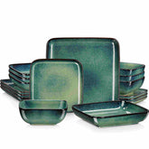
Cool greens, soft teals, muted blue‑gray |
Soft‑touch semi‑matte to reduce visual noise |
Use higher contrast to make smaller portions feel generous |
Sandwich and salad, yogurt with toppings |
End‑of‑shift wind‑down (around 7:30 AM) |
Calm and release |
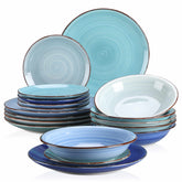
Misty blue, sage, stone, ivory |
Matte or satin; fewer high‑shine highlights |
Lower contrast for a smaller‑looking, lighter plate |
Oatmeal, poached eggs, fruit, herbal tea |
These suggestions are meant to feel friendly, not bossy. If you adore a fire‑engine red mug, keep it for your pre‑shift espresso; if mint calms you, let it be the backdrop for your wind‑down oats.

Portion Control With Color and Contrast
The human eye loves edges and contrast. In tests discussed by MALACASA and color psychology write‑ups, high contrast between food and plate draws the eye, sharpens edges, and can make a serving look larger. Low contrast blends edges and can make a serving look smaller. This means you can play a quiet visual game that supports your goals. When you want a smaller portion to feel satisfying during the night, plate pale grains or light proteins on a darker or richer‑toned plate. When you legitimately need more calories for a demanding shift and don’t want your plate to feel overwhelming, choose a plate that shares the food’s color family, like a light beige plate for lightly sauced pasta or a pale stone plate for roast chicken.
Warm hues can stimulate appetite; that’s useful if your appetite stalls pre‑shift, but it can become a liability if it tempts you toward a second helping mid‑shift. Cool hues may curb intake a bit, which is handy for snack control. The key is intentionality. Decide the appetite effect you want before you reach for a plate, and let the color do quiet work.

Glaze, Finish, and Light at 2:00 AM
Under bright, cool, overhead lighting, ultra‑glossy plates can feel sparkly and energetic; in the middle of the night that can be wonderful or distracting. Semi‑matte and satin glazes read a little softer in those conditions, which many night shifters find more comfortable in the last hours before bed. Durability should stay front‑of‑mind. Editorial tests from outlets like Epicurious, Serious Eats, Bon Appétit, Food & Wine, and Wirecutter consistently find stoneware and porcelain to be reliable for daily use, with plenty of dishwasher‑safe and microwave‑safe options. Do note that some matte glazes show light utensil marks, while many glossy glazes mask them better. Lighter semi‑matte finishes, like those on some Year & Day pieces, can pick up scuffs that usually buff out with a gentle cleanser.
The underside matters too. Raw or rough foot rings on some stoneware can scuff delicate dining tables. Multiple product testers recommend adding placemats or a tablecloth if your plates have a textured base. Those placemats also add a surface color you can use to tune your overall palette without buying a whole new set.

Safety First: Heavy Metals, Glazes, and Nightly Heating
Not all color is created equal. Industry guidance and consumer safety notes point out that heavy metals like lead and cadmium have historically been used in some pigments and glazes to achieve saturated hues and glossy finishes, especially in overglaze decorations and metallic rims. Quality manufacturers meet modern safety standards, but if provenance is uncertain, choose carefully. Plain white porcelain is a perennial safe bet. Among decoration methods, underglaze and in‑glaze styles are generally considered safer for food contact because pigments are sealed under or within the glaze during high‑temperature firing. Overglaze decorations, especially metallic banding, deserve more scrutiny. A simple at‑home precaution for new pieces is to soak them in vinegar for a few hours before first use and avoid microwaving highly decorated wares unless the maker clearly states they are microwave‑safe.
Decoration method |
What it means |
Food‑contact safety cues |
Buying and usage notes |
Underglaze |
Pattern painted on the bisque/clay, then clear glazed and high‑fired |
Pigments locked under glaze; food‑contact areas are smooth |
Often shows classic blue/green motifs; typically a safe everyday choice |
In‑glaze |
Pigment fused into the glaze during high‑fire |
Pigments harder to leach; smooth, glossy surface |
Good balance of color and durability |
Overglaze/metallic rim |
Decoration applied on top of glaze and re‑fired lower |
Can be more vulnerable if quality control is poor; verify microwave and food‑safety claims |
Treat with care; avoid microwave unless explicitly rated safe |
When in doubt, prioritize pieces labeled food‑safe by the manufacturer and look for regulatory confidence markers such as FDA food‑contact safety and California Prop 65 compliance. If you reheat meals on your plates at odd hours, selecting microwave‑safe, undecorated interior surfaces is a clean, calm choice.
Material Matters for Midnight Meals
The clay body behind your glaze shapes weight, durability, and heat behavior. You do not need a ceramics degree to get this right; a quick material snapshot can steer you.
Material |
Feel and durability |
Heat handling examples |
Care notes and real‑world quirks |
Stoneware |
Heftier, rustic, very durable for daily bumps |
Many sets are oven‑safe; brands like Le Creuset stoneware are often rated up to 500°F in product guides |
Weight can be substantial; some raw foot rings may scuff tables; handles thermal shock decently with reasonable care |
Porcelain (vitreous china) |
Smooth, refined, chip‑resistant; lighter than stoneware |
Commonly dishwasher and microwave safe; some sets oven‑safe to 350–480°F per editorial testing |
Bright whites show food beautifully; can feel crisper and stack neatly |
Bone china |
Thin, elegant, surprisingly chip‑resistant |
Often microwave and dishwasher safe; check maker’s label |
Lightest feel; vegans may avoid due to bone ash content |
Tempered/glass composites |
Lightweight, stackable, very chip‑resistant |
Many are microwave and dishwasher safe |
Modern look; great for kids and outdoor use; some feel more casual |
Melamine/bamboo composites |
Ultra tough, picnic‑friendly |
Not microwave safe |
Fantastic for late‑night outdoor breaks or communal break rooms where drops happen |
These are category tendencies, not universal rules. Always check the manufacturer’s care label, especially if you plan to cycle plates between fridge, microwave, and warm oven during a long shift.

Smart Buying for Shift Life
The best night‑shift tableware mixes grace and grit. Restaurant‑tested stoneware lines, like the handmade sets praised by Wirecutter and used widely in service environments, bring confidence to hurried mid‑shift cleanups. Design‑forward porcelain collections highlighted by Epicurious, Bon Appétit, and Food & Wine offer lighter weight and crisp plating space when you want your food to look like a reward after a hard night. Open‑stock programs, celebrated by consumer guides and reviewers, are a gift to shift crews because you can replace a single plate without buying a whole box. If storage is tight, straight‑walled coupe shapes nest efficiently, though they can stack tall in dishwashers; sloped rims are a nice middle ground that handle well and store easily, a point Good Housekeeping emphasizes.
Color choices need not be expensive. Interior and style editors at Architectural Digest and New York Magazine’s Strategist routinely show how a neutral, everyday base can dress up with a seasonal accent plate or statement bowl. That’s a smart way for a night shifter to maintain a calming default and then clip in a warm accent when an energy boost is welcome.

Care and Maintenance When You Live Nocturnal
Your plates will work as hard as you do. Daily dishwasher cycles at odd hours demand glazes that tolerate real life. Most modern stoneware and porcelain sets are dishwashable, and many are safe for the microwave, but delicate metallic banding is often not. If your semi‑matte finish shows gray utensil traces after a turkey club at 3:00 AM, a gentle scrub with a non‑abrasive cleaner typically lifts them. For stoneware with exposed clay rings, a placemat under your midnight meal preserves table surfaces. If you picked darker, semi‑matte plates for your end‑of‑shift calm, treat them to an occasional baking‑soda paste to refresh the glow. And if your set is open stock, embrace the freedom to mix in a single cool‑green salad plate to test its effect on your appetite before you buy a full stack.
A Quick Color‑Effect Cheat Sheet
Think of this as a friendly nudge, not a rulebook. Use it to experiment, then trust what your body tells you after a week.
Plate color |
Typical appetite/mood cue |
Night‑shift sweet spot |
Warm reds/oranges/yellows |
Energizing, appetite‑stimulating |
Pre‑shift meals when you want momentum |
Soft blues/greens |
Calming, sometimes appetite‑suppressing |
End‑of‑shift wind‑down and mindful mid‑shift pacing |
Earthy neutrals (stone, ivory, sand) |
Grounding, flexible |
All‑purpose base for mixing warm or cool accents |
Deep charcoals/navies |
Dramatic, high contrast with lighter foods |
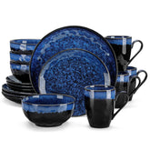
Portion‑generous look for light‑colored foods; great when you want smaller servings to feel ample |
Individual differences are real. If blue kills your appetite too much, shift toward mint, sage, or blue‑gray. If warm tones feel chaotic late at night, keep them in mugs or bread plates where you can dial the dose.

Evidence Touchpoints and Why They Matter Here
Lighting and color research does not live in the dish aisle, yet the principles cross over cleanly. Circadian findings from a randomized cross‑over study in Copenhagen reinforce timing and spectral awareness: lean blue and bright when you need alertness, warm and dim when you need to drift toward sleep. Color psychology sources, including hospitality and flavor‑perception roundups, repeatedly show that contrast makes food look fresher and more intense, and that warm palettes can encourage intake while cool palettes calm. Sleep education from the Sleep Foundation and interior advice from House Beautiful converge on softer tones and gentle visuals in wind‑down spaces. Tableware testing by Epicurious, Serious Eats, Bon Appétit, Food & Wine, Wirecutter, Forbes, and others gives us the material and care context to select pieces that survive graveyard‑shift realities. Pulling these threads together gives night‑shift workers a toolkit that is both artful and practical.
Optional FAQ
Do blue plates counteract blue light? No. Blue light refers to the wavelength of emitted light, not the color of an object. A blue plate does not emit blue light; it simply reflects a blue appearance. Its value is psychological and perceptual: many people find blue and green palettes calming, and some experience a slight appetite‑curbing effect.
Are brightly colored glazes unsafe? Bright color alone is not a verdict. Safety depends on glaze chemistry and firing. Underglaze and in‑glaze decorations from reputable makers are designed for food contact. Metallic overglaze banding and unknown bright inner‑wall decorations warrant extra caution. Look for FDA food‑contact statements and California Prop 65 compliance, and avoid microwaving decorated ware unless the maker says it is safe.
Will warm plates at midnight ruin my sleep? Warm hues tend to feel more energizing. Use them earlier in your shift or for targeted pep. As you approach bedtime, favor cooler, desaturated palettes and warmer room lighting to support wind‑down, a rhythm supported by sleep education resources and lighting studies.
In the real world, your table is a mood board you eat from. Curate it for the moment you’re in. Give your pre‑shift self an effervescent, sun‑kissed plate, then land your dawn with misty greens and gentle blues. Play with contrast when you want portions to look generous or restrained. Favor safe glazes and durable clays, and lean on open stock to evolve your set. That’s colorful, pragmatic joy—served exactly when you need it most.
References
- https://pmc.ncbi.nlm.nih.gov/articles/PMC4673571/
- https://www.sleepfoundation.org/bedroom-environment/what-color-helps-you-sleep
- https://www.28ceramics.com/is-the-color-of-ceramic-tableware-the-brighter-the-more-dangerous.html
- https://www.foodandwine.com/best-dinnerware-sets-6831579
- https://www.seriouseats.com/best-dinnerware-sets-7376024
- https://www.architecturaldigest.com/story/best-dinnerware-sets
- https://www.bonappetit.com/story/best-dinnerware-sets?srsltid=AfmBOoqc0SNuH3wt9OBfyV1rwJeoyToJe4I856VcA-1Qvyqw4_Nav-zo
- https://theartisanemporium.co.in/mastering-ceramic-colors-a-practical-guide-to-choosing-your-palette/?srsltid=AfmBOorI88Pi5JIZTSLk2B4BB3L12UGpZ2lWb1MEEC73tIgIj94GRnsM
- https://smart.dhgate.com/elevate-your-special-occasions-expert-tips-for-using-ceramic-tableware-with-style-and-elegance/
- https://www.elfinview.com/ceramic-dinnerware/


